

User Interface Enhancements
The user interface enhancements listed below were added to improve user experience and consistency in Veeva CRM's user interface. Select the thumbnail to view a larger image.
231.2.200 (June 1, 2023)
|
Platform |
Description |
Before |
After |
|---|---|---|---|
|
Browser |
Users can now access the MyInsights Studio introduction help topic by selecting the information icon that displays on the right of the MyInsights Studio banner. |
|
|
|
Browser |
To make input fields easier to read in MyInsights Studio, the padding and margins surrounding them in forms are larger. |
n/a |
n/a |
|
Browser |
To easily navigate in MyInsights Studio, breadcrumbs for Content, Template, and Distribution Channels display in the top, left-hand corner of the MyInsights Studio pages. |
|
|
|
Browser |
The space between the Label and Value sections in the Pages section in MyInsights Studio is larger. In addition, labels and values do not break across words, and selected expressions are in bold. |
n/a |
n/a |


231.1.200 (May 4, 2023)
|
Platform |
Description |
Before |
After |
|---|---|---|---|
|
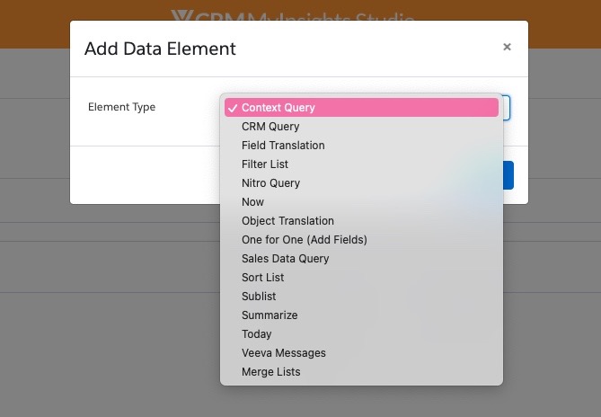
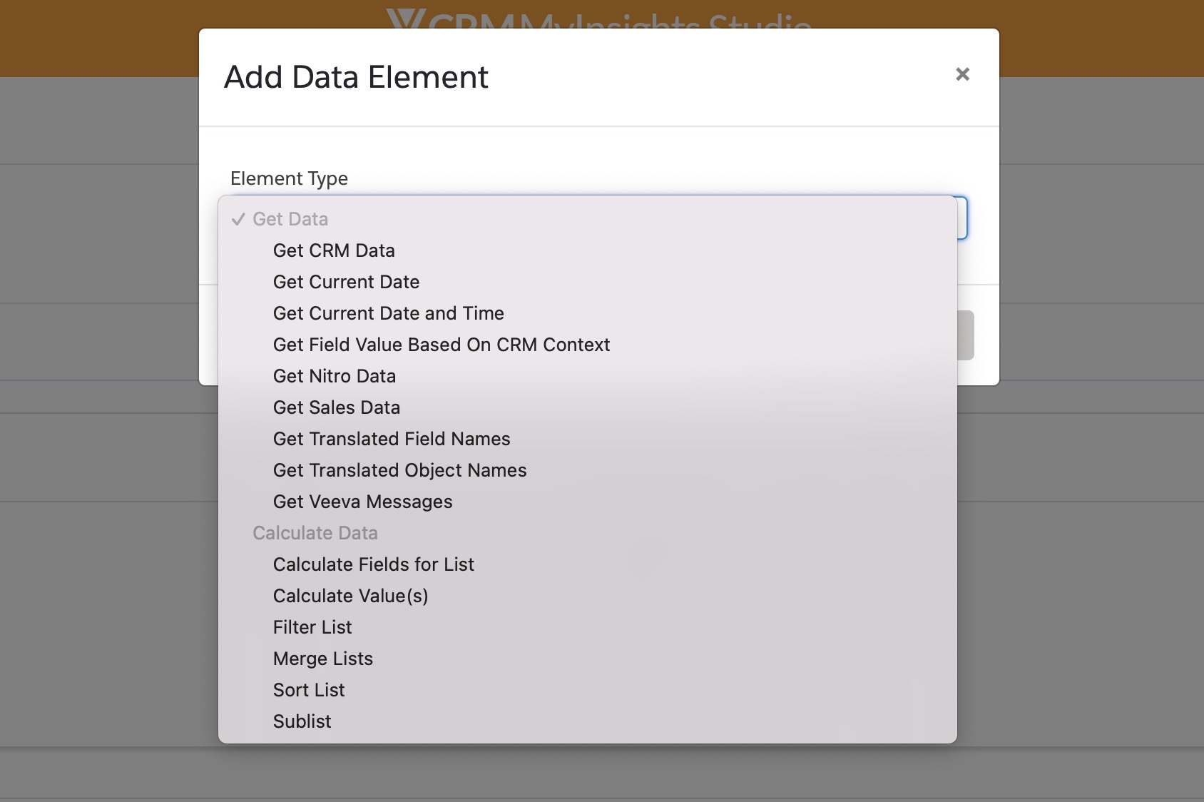
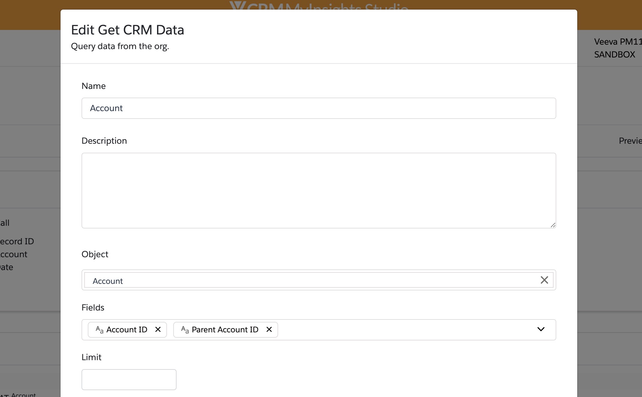
Browser |
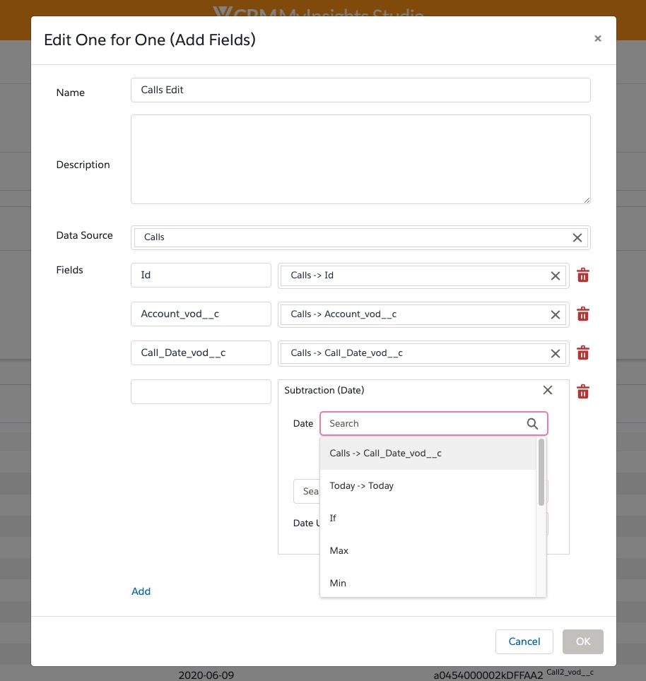
The Element Type drop down list in MyInsights Studio now displays available elements alphabetically, and grouped into two categories: Get Data and Calculate Data. Element types are more descriptive. |
|
|
|
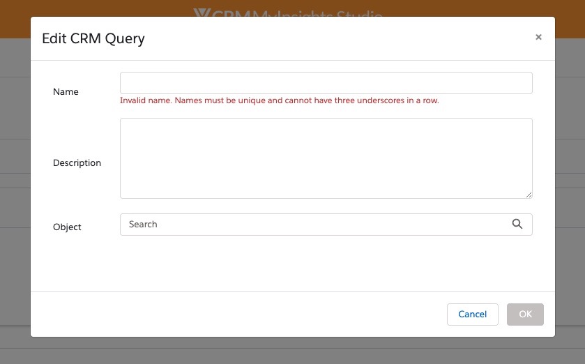
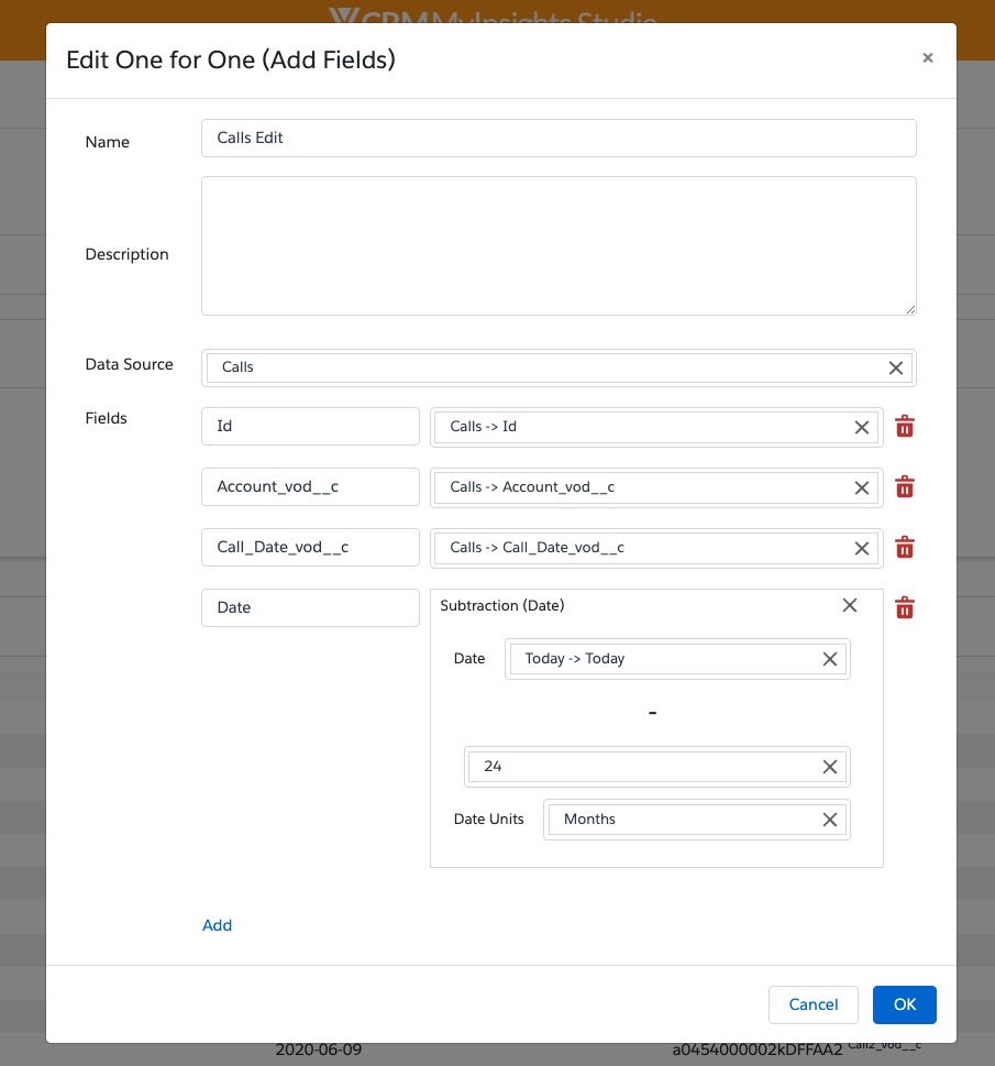
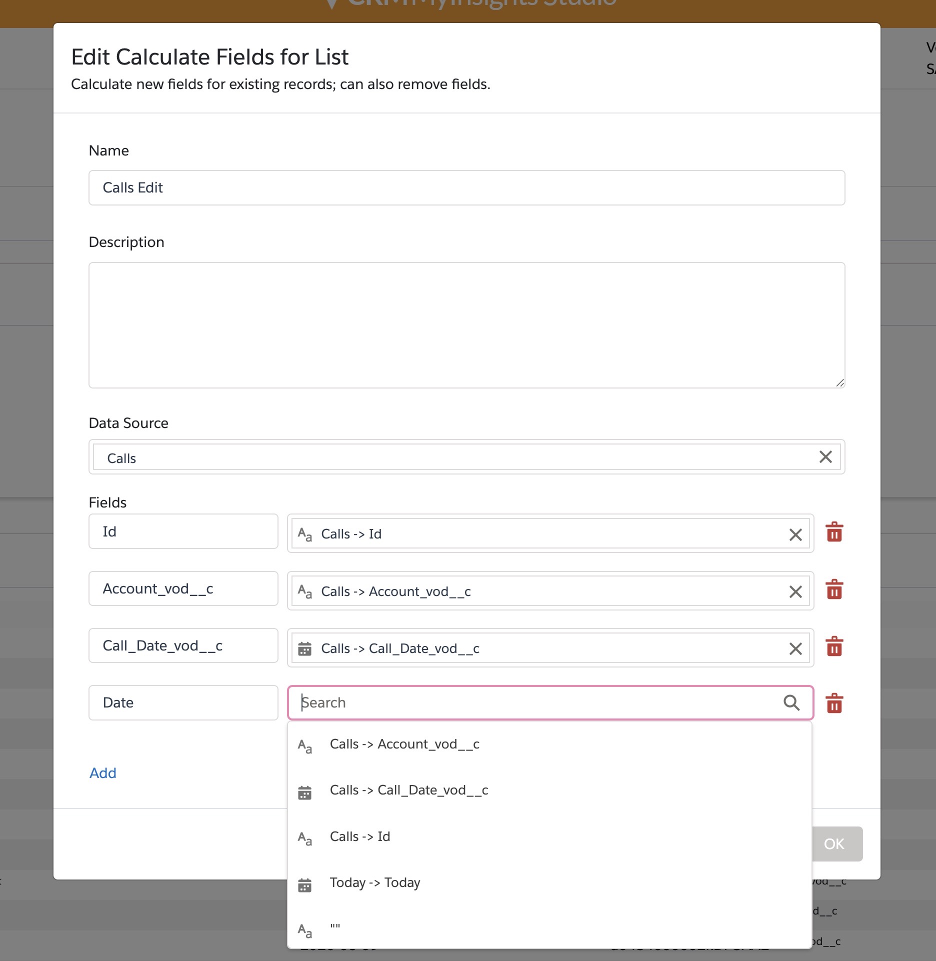
Browser |
The element type definition of the selected data element in MyInsights Studio displays as a subtitle in the Edit modal. |
|
|
|
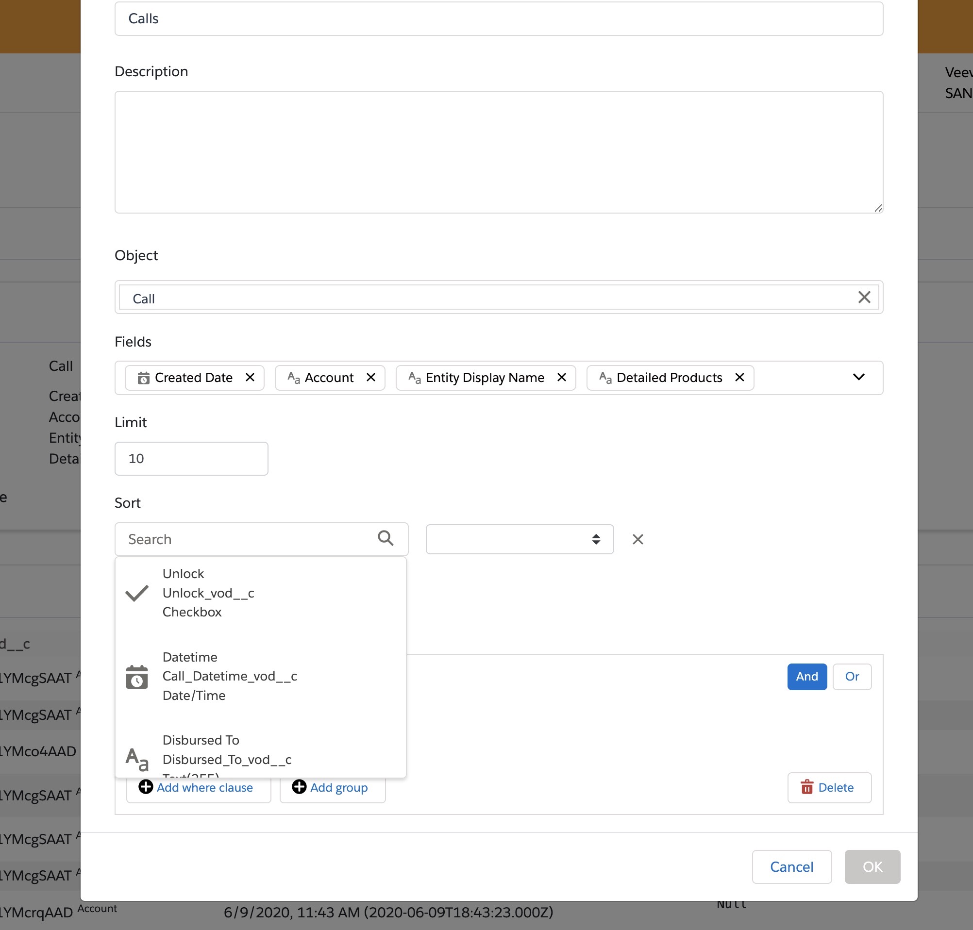
Browser |
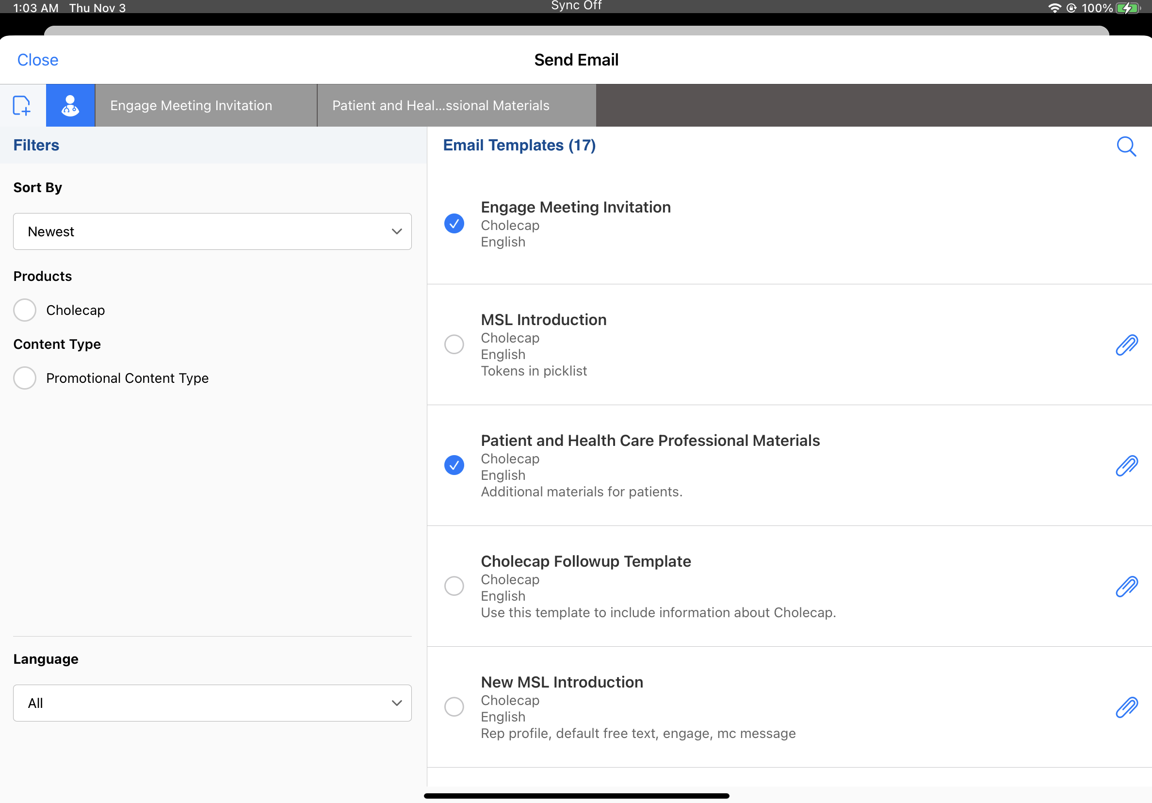
Data types in expressions and queries have icons next to each field in MyInsights Studio. |
|
|
|
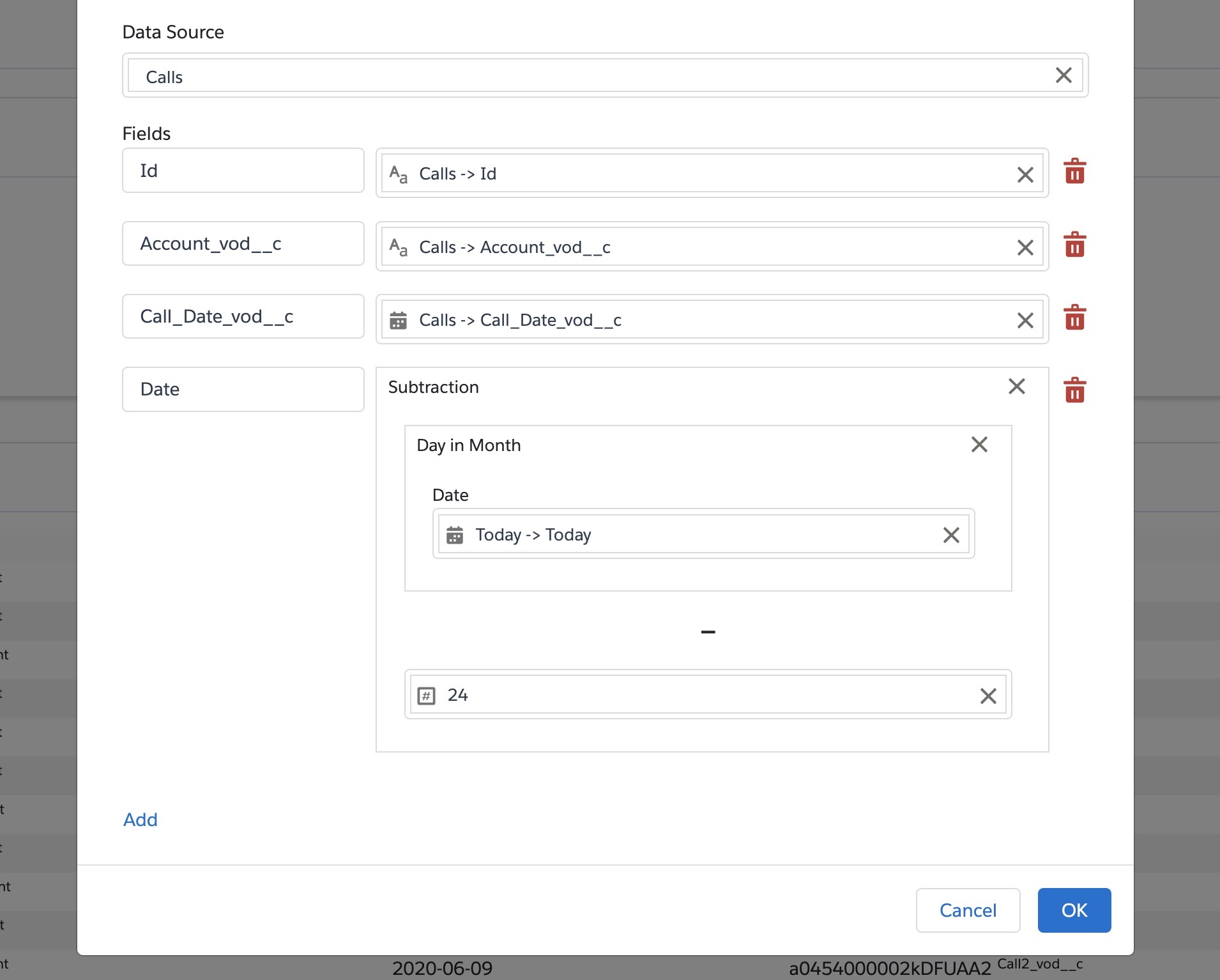
Browser |
Several expressions used to perform data calculations in MyInsights Studio are renamed for clarity, and descriptors for the changed data calculations are added. |
|
|
|
Browser |
When creating an expression to perform a data calculation in MyInsights Studio, available options are listed by order of relevance. Fields from the local data element (if any) are displayed first, followed by fields from singleton data elements, hard-coded expressions, and calculation expressions. |
|
|
|
Browser |
Standard keyboard navigation in MyInsights Studio works consistently in edit mode, including up and down arrows, tab, esc, and enter keys. |
n/a |
n/a |

223.2.100 (February 2, 2023)
| Platform | Description | Before | After |
|---|---|---|---|
|
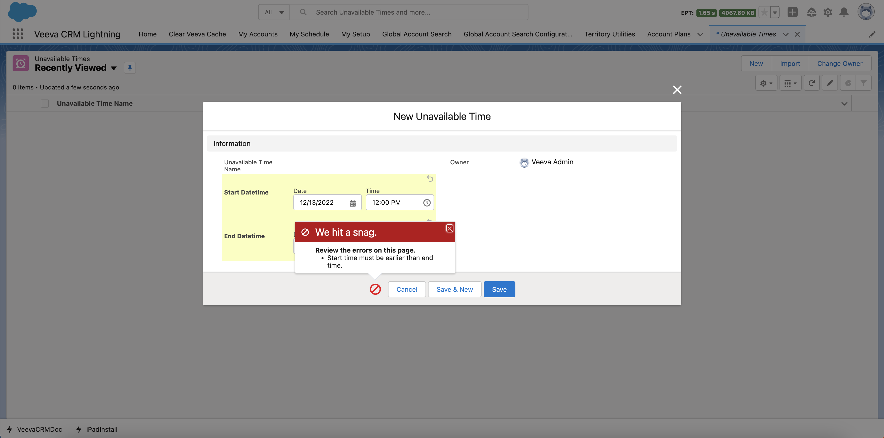
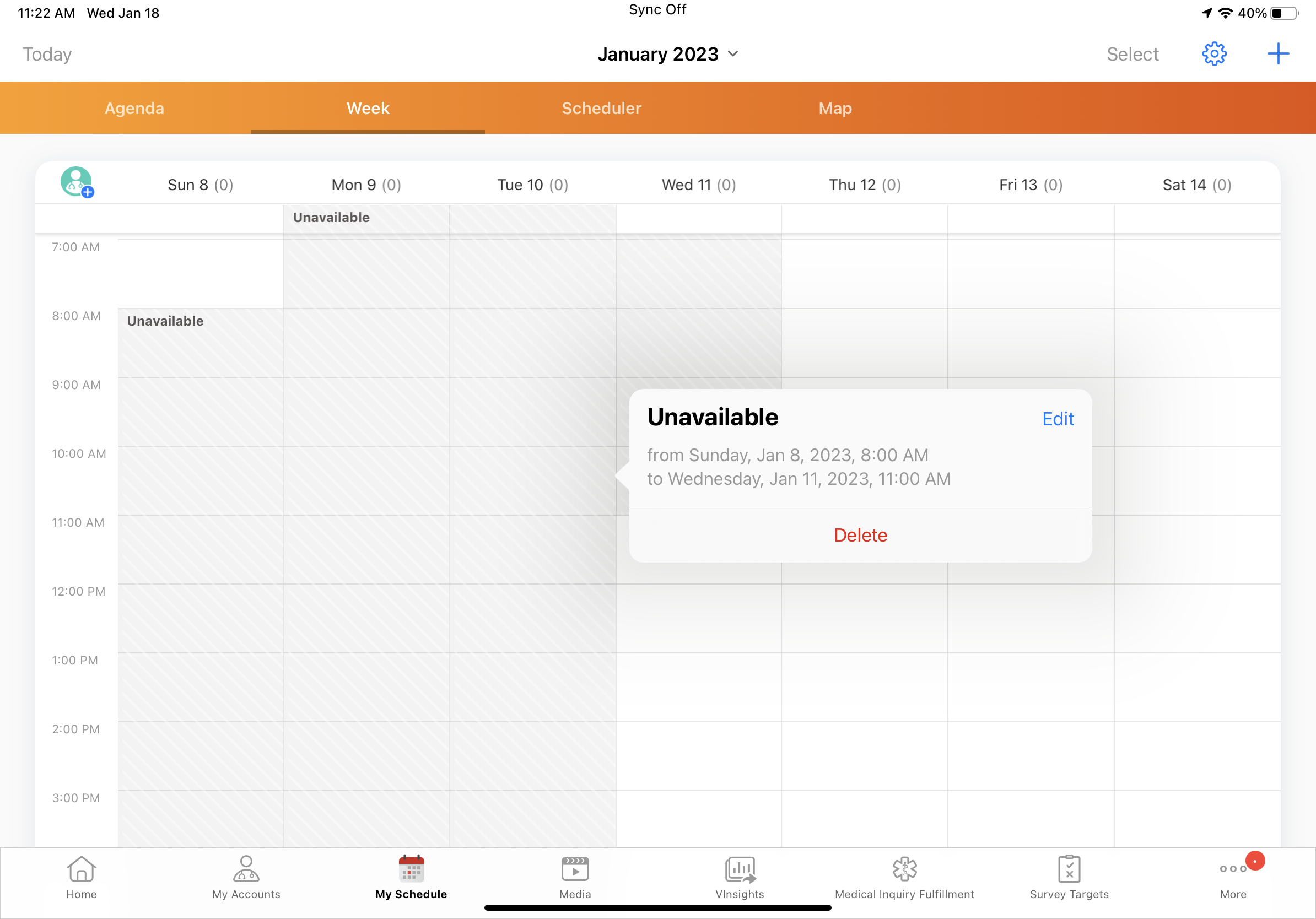
An error displays if admins attempt to save an Unavailable_Time_vod record with a start datetime after the end datetime or with blank start or end datetime fields. |
n/a |
|
|
|
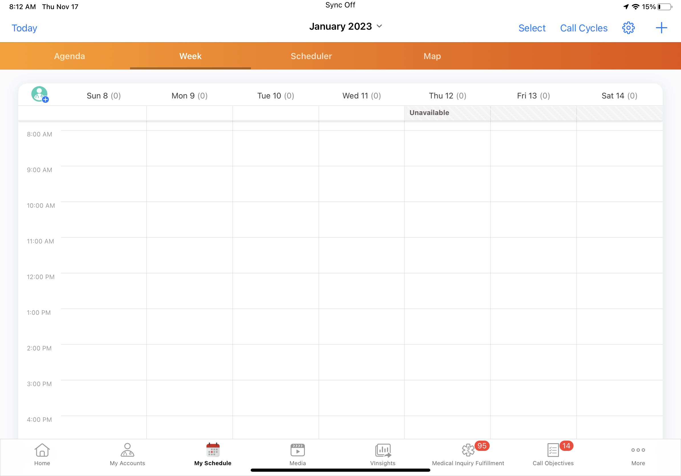
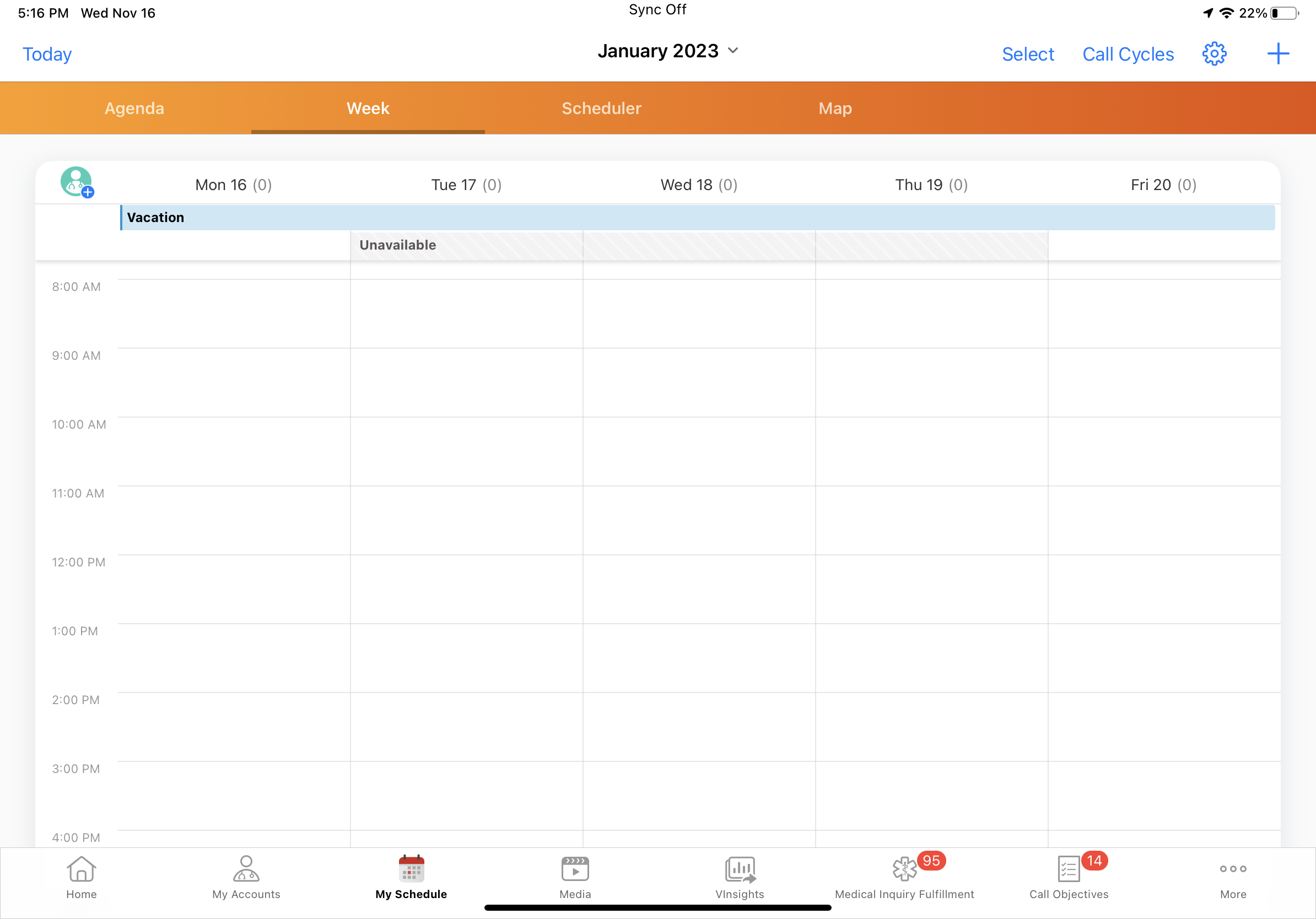
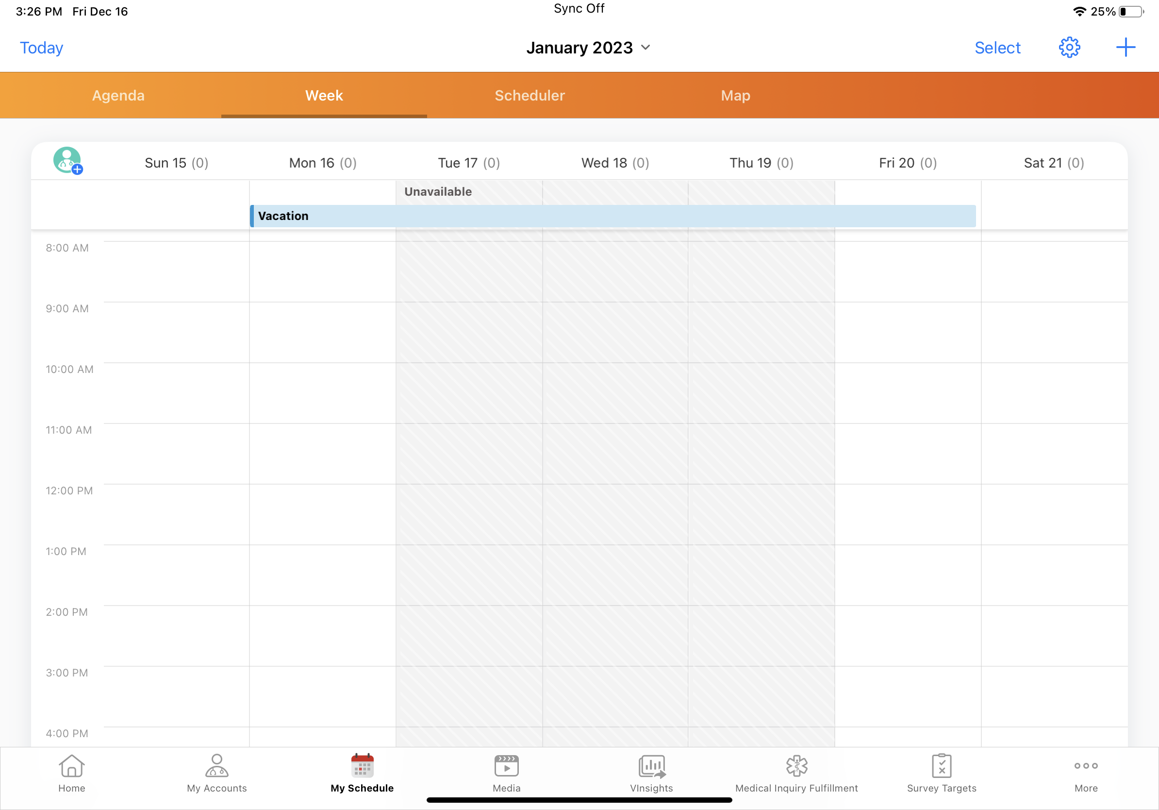
iPad |
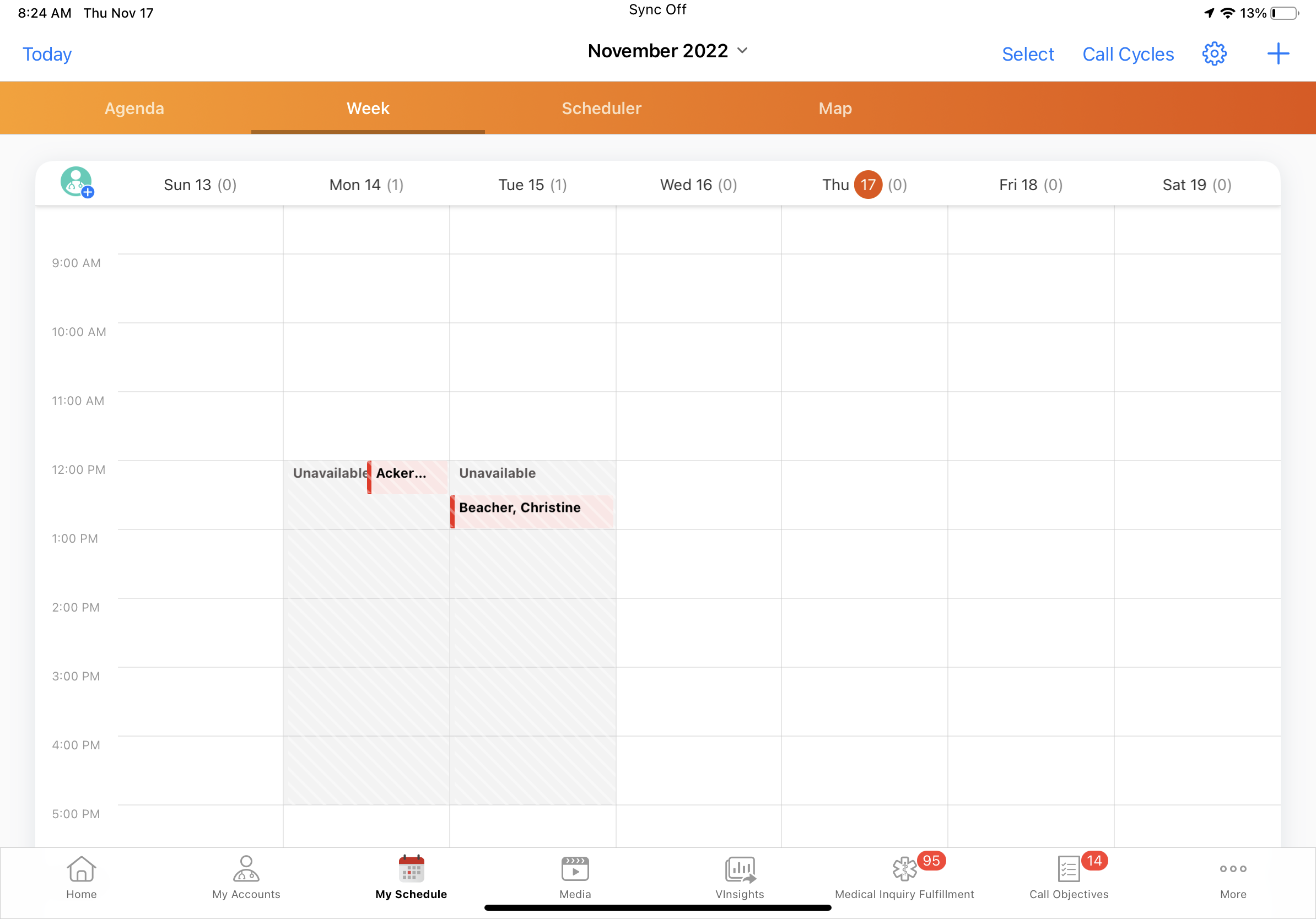
All-day unavailable time slots display over the entire day, rather than only displaying in the calendar header. |
|
|
|
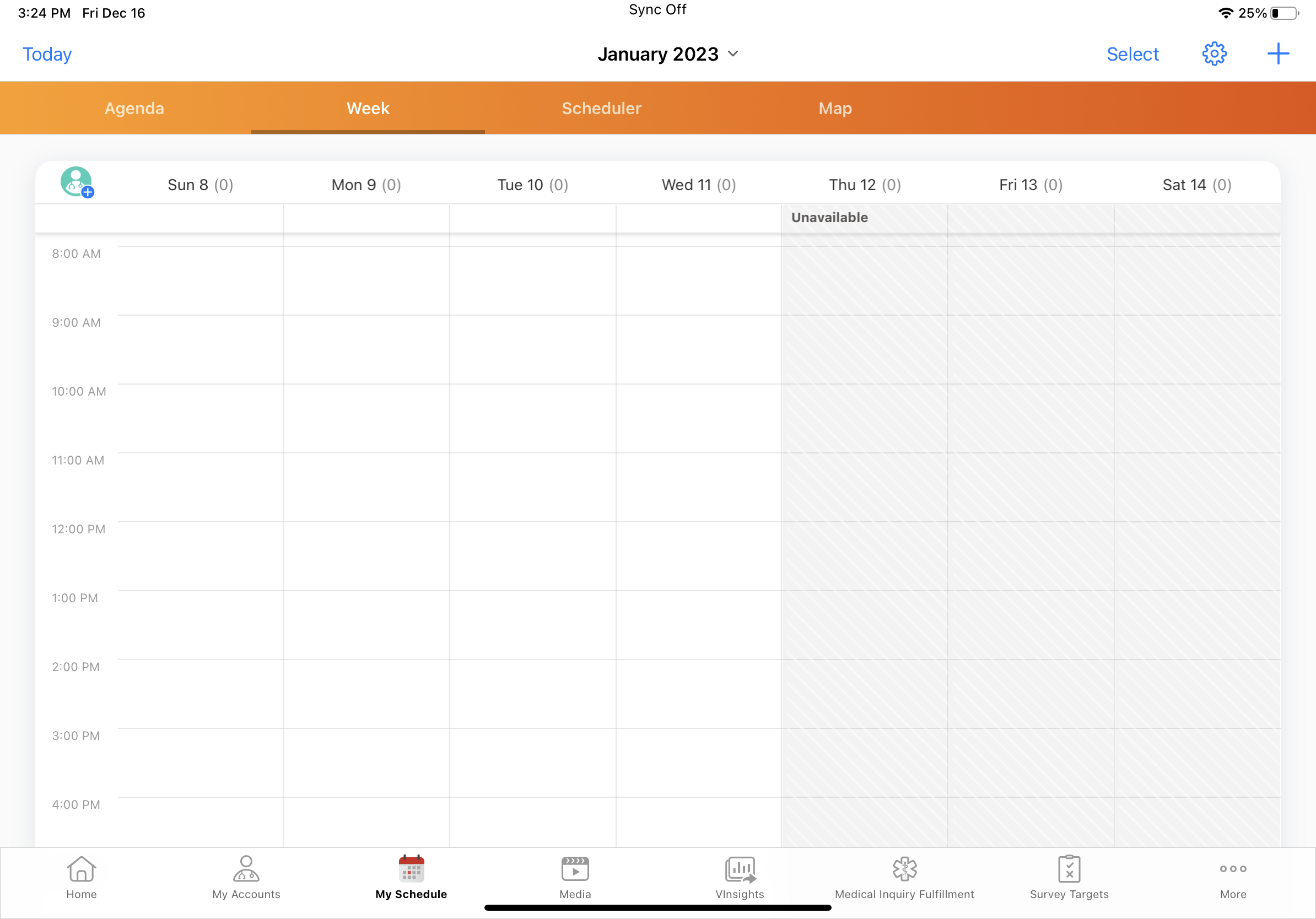
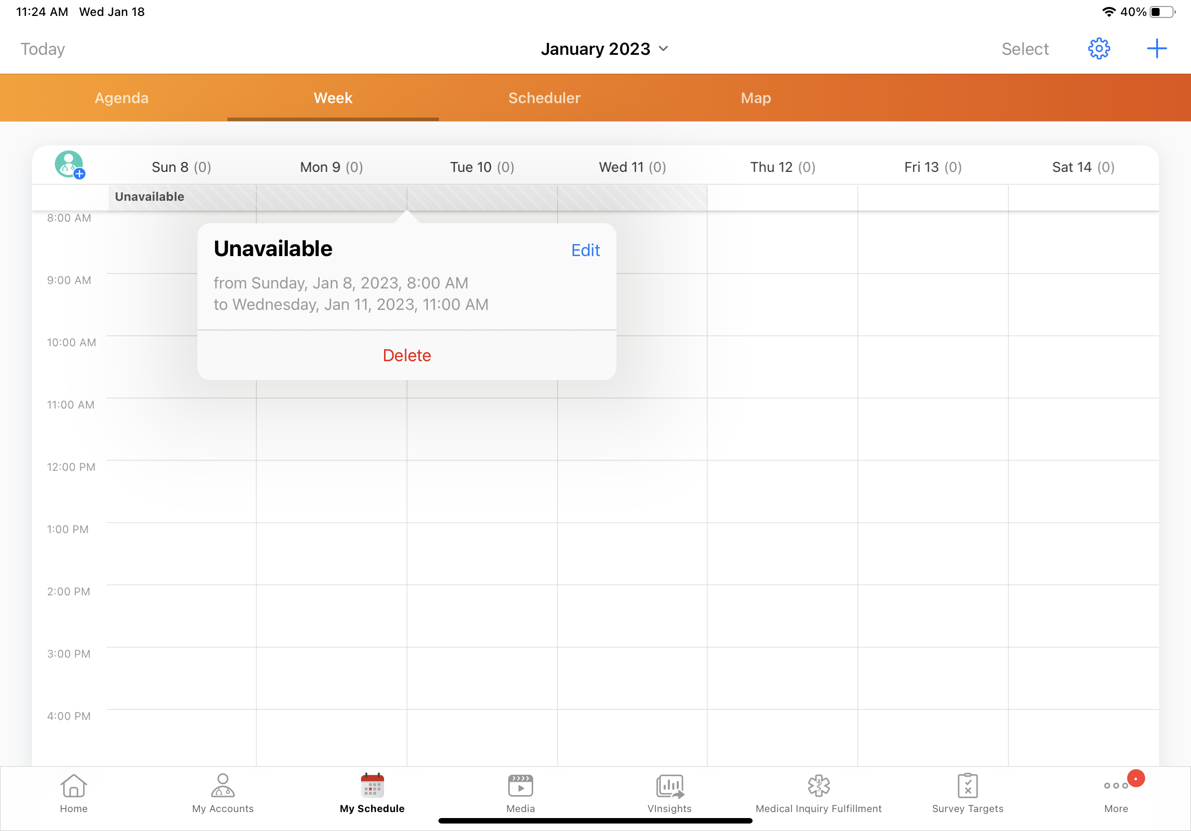
iPad |
When a multi-day unavailable time slot starts or ends part of the way through a day, My Schedule reflects the start and end times. |
|
|
|
iPad |
All-day and multi-day unavailable time slots always display at the top of the calendar header. |
|
|
|
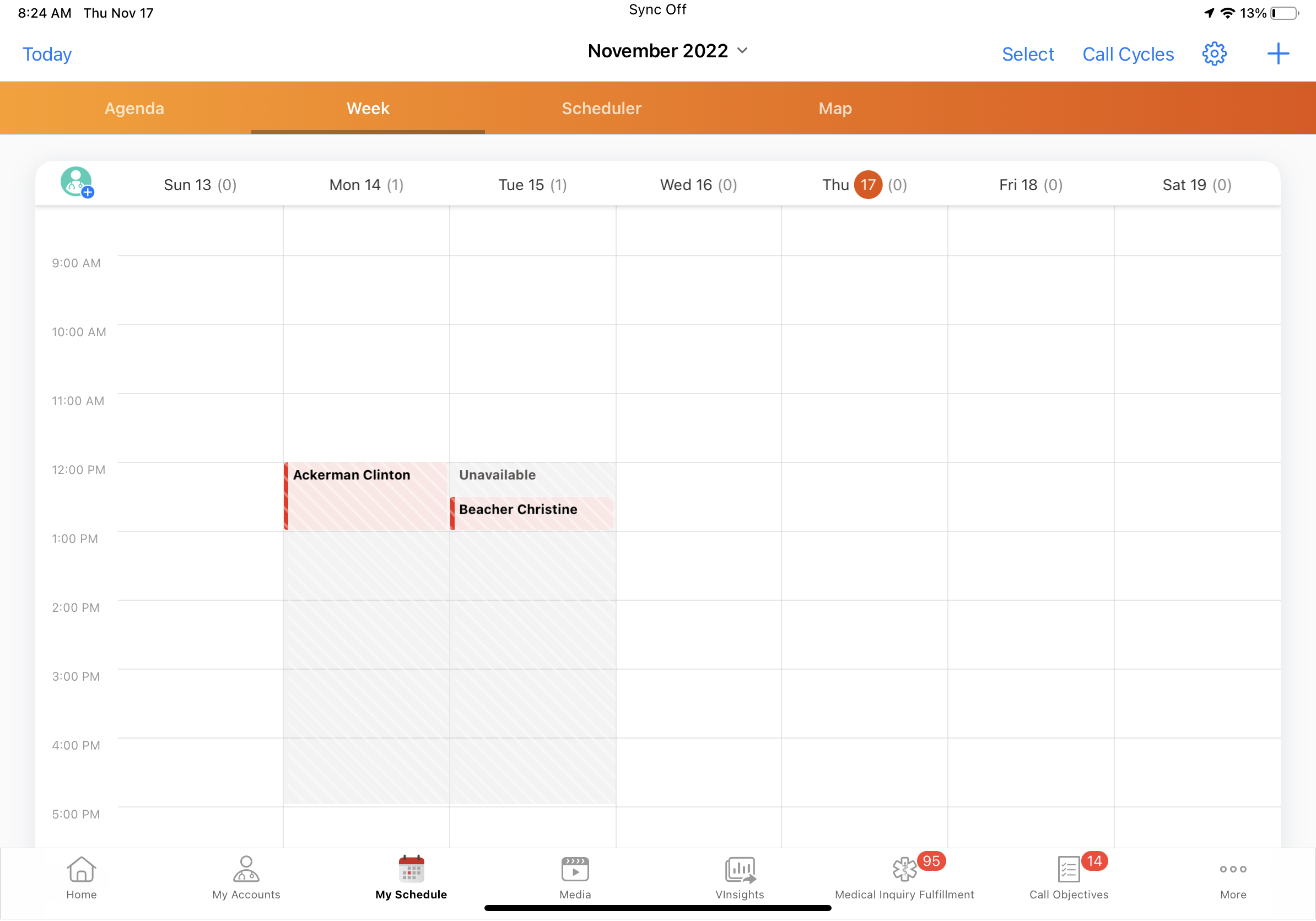
iPad |
When an unavailable time slot and another calendar entry start within 30 minutes of one another, the calendar entry displays at half the column width. |
|
|
|
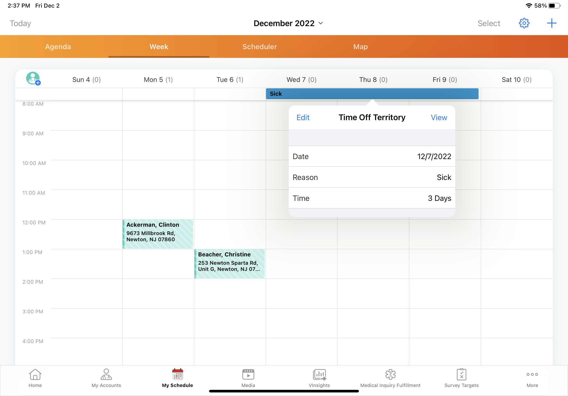
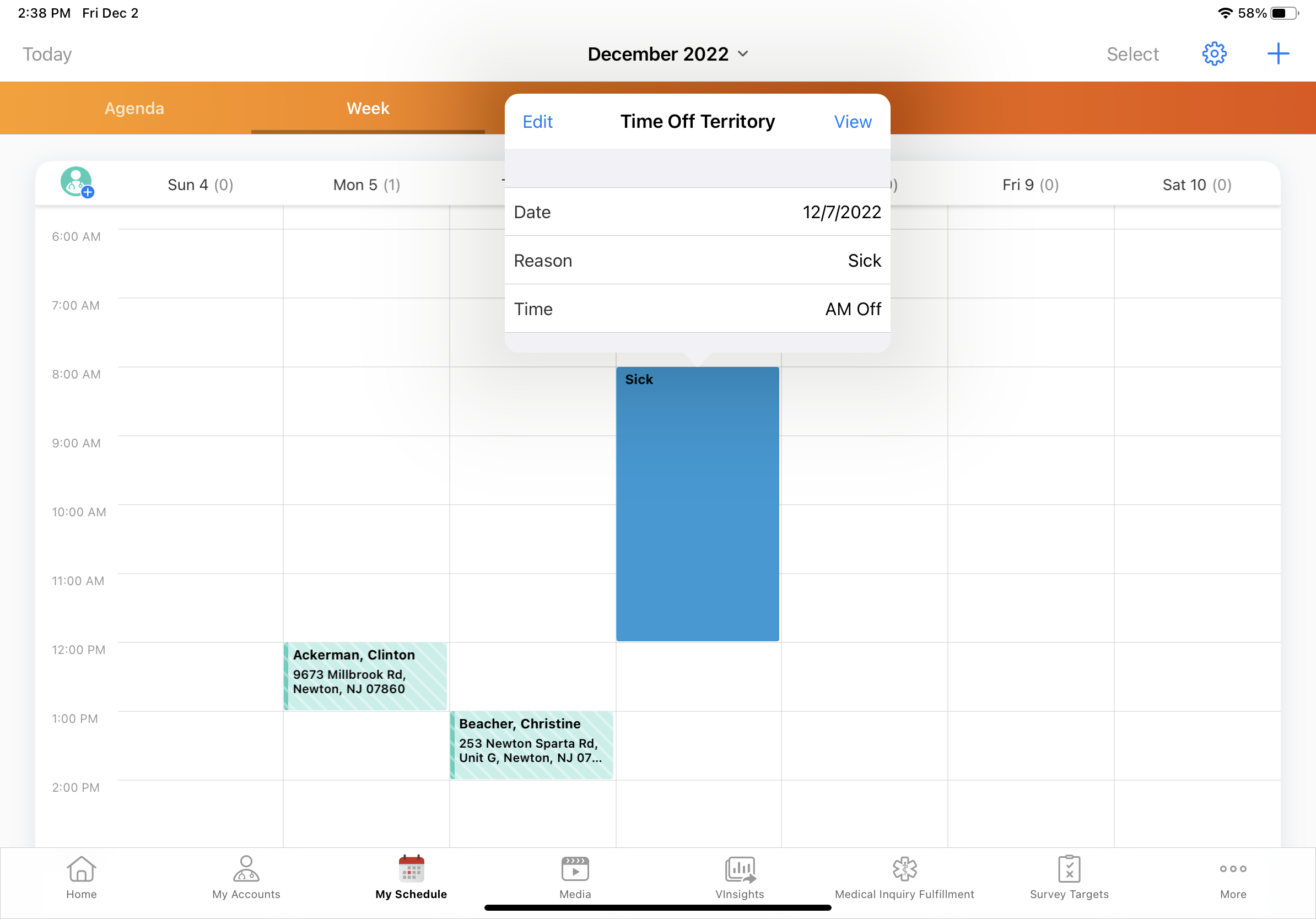
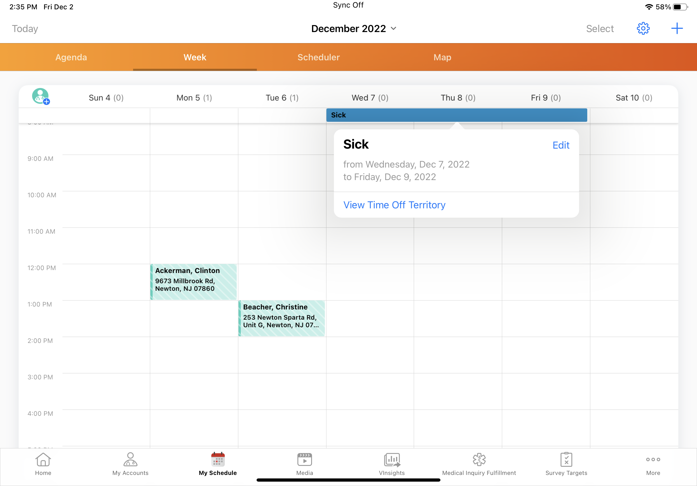
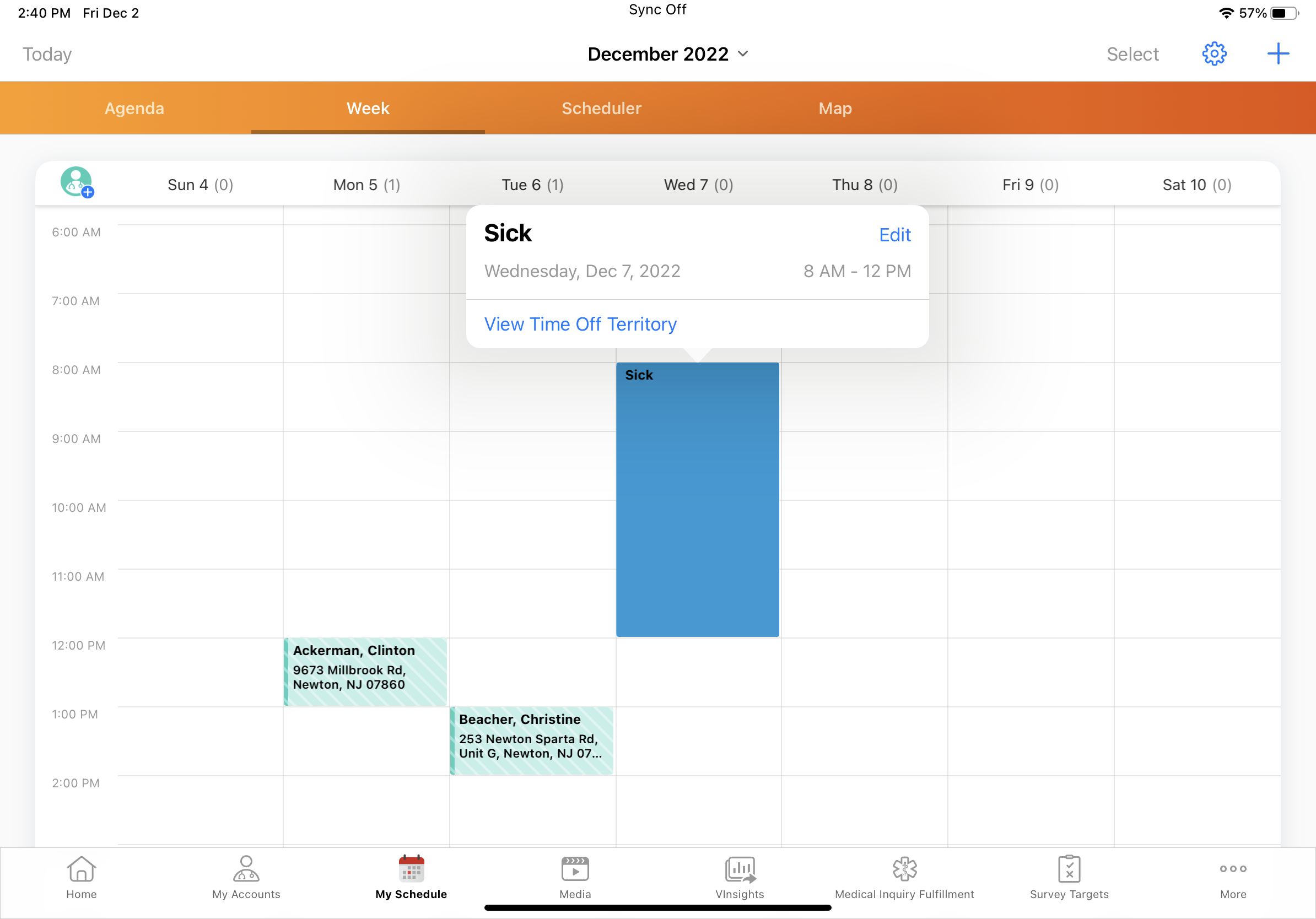
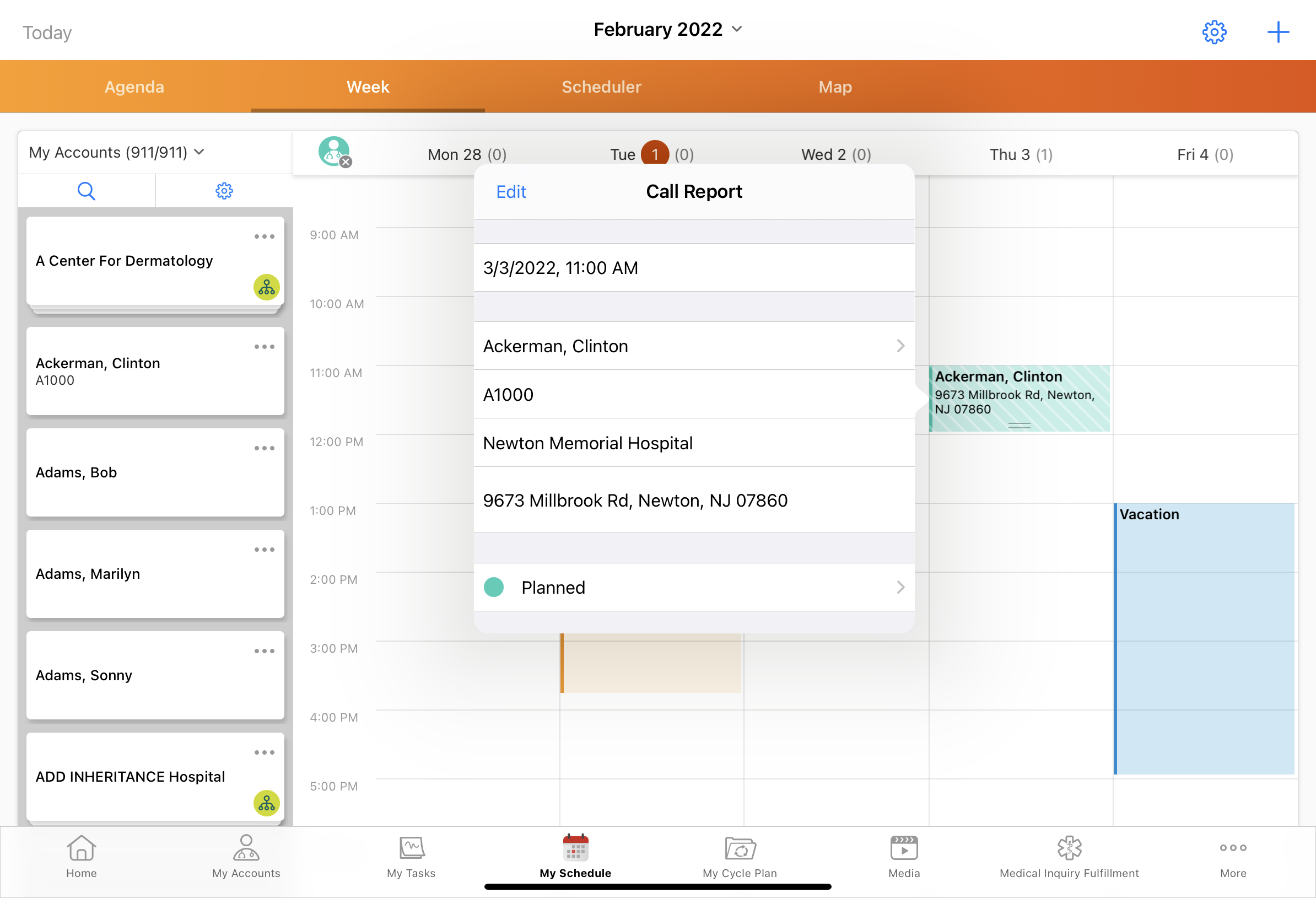
For consistency across My Schedule popovers, the Time Off Territory popover is updated:
|
|
|
|
|
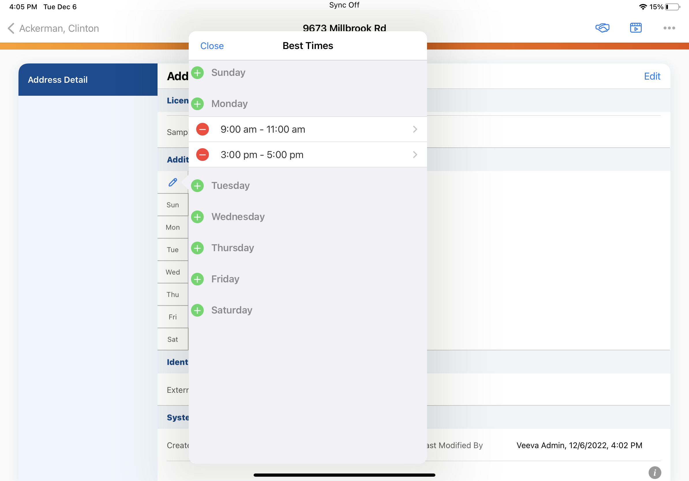
The Office Best Times popover resizes to fit the listed days and times. |
|
|
|
|
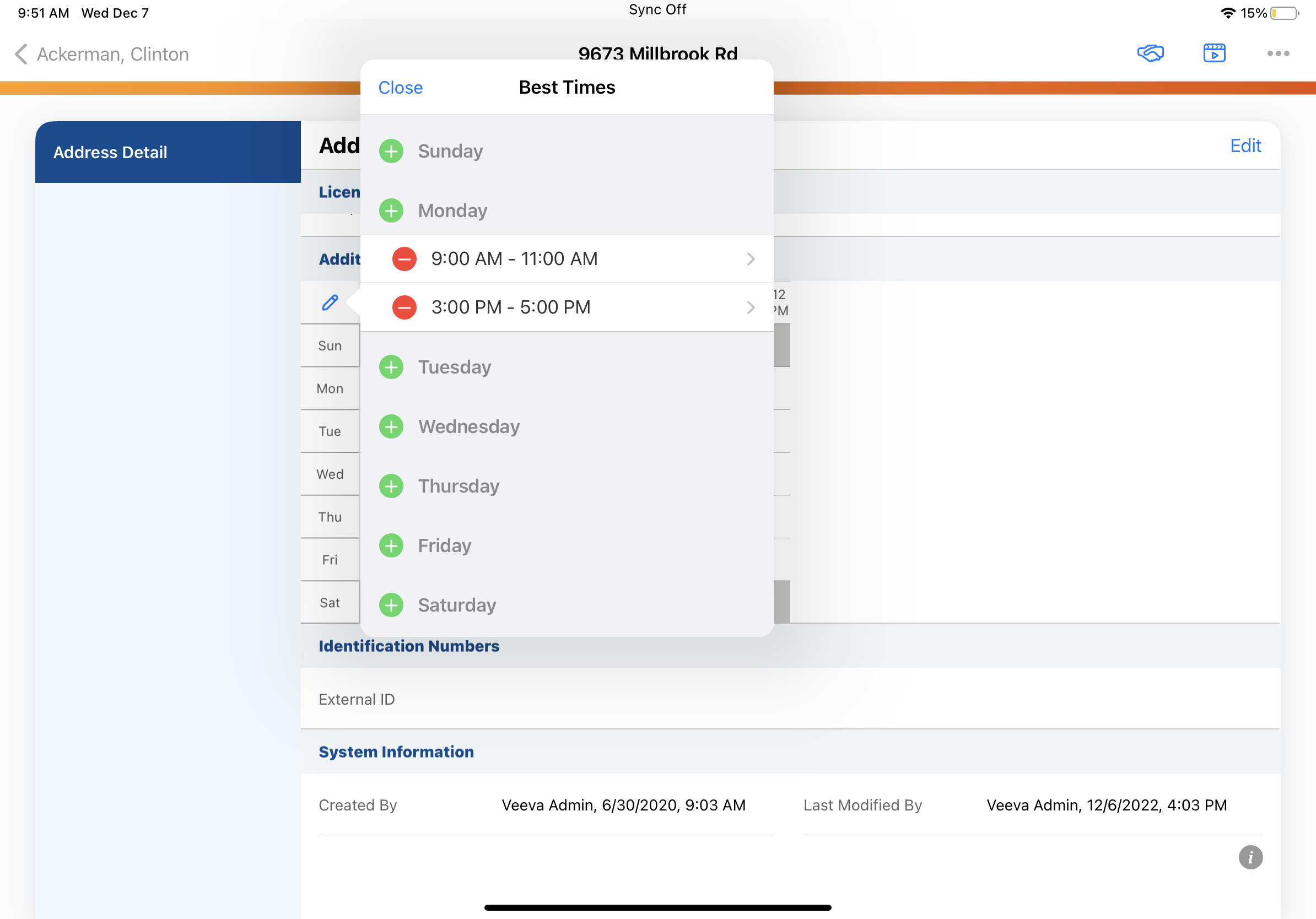
iPad |
Days and times in the Office Best Times popover are localized. For users with the en_US locale, AM and PM are now capitalized. |
|
|
|
iPad |
The Back button is labeled according to the Best_Times_vod field label on the Address_vod object. If the Best_Times_vod field label exceeds the available space, the button defaults to Back instead. |
|
|
|
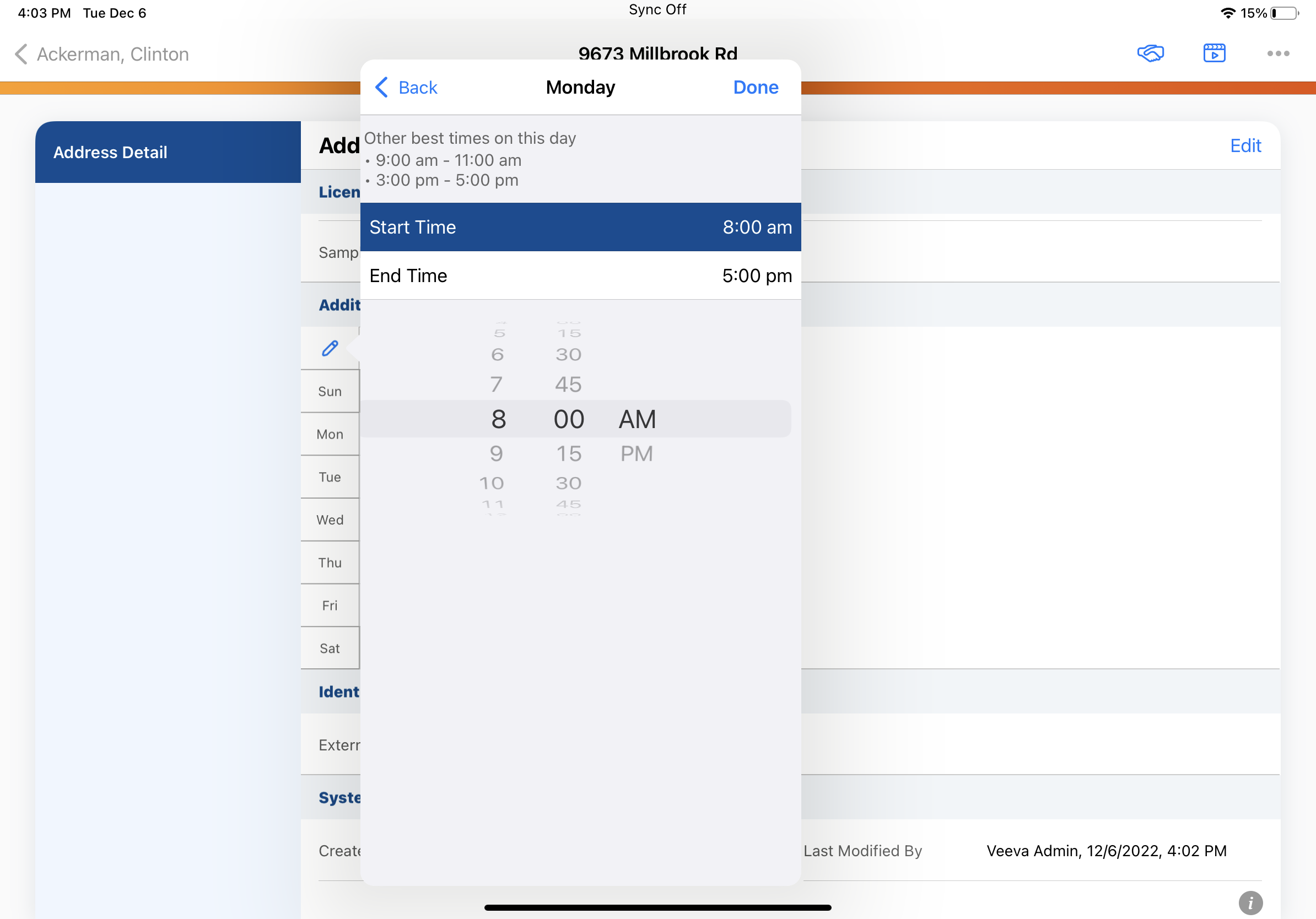
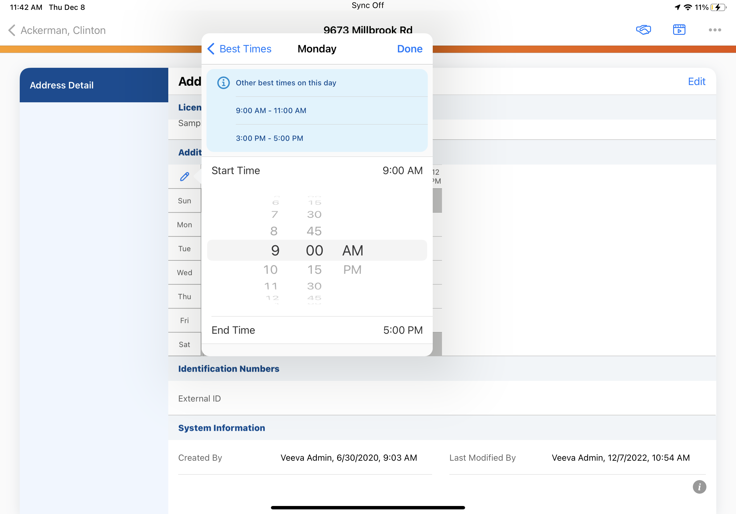
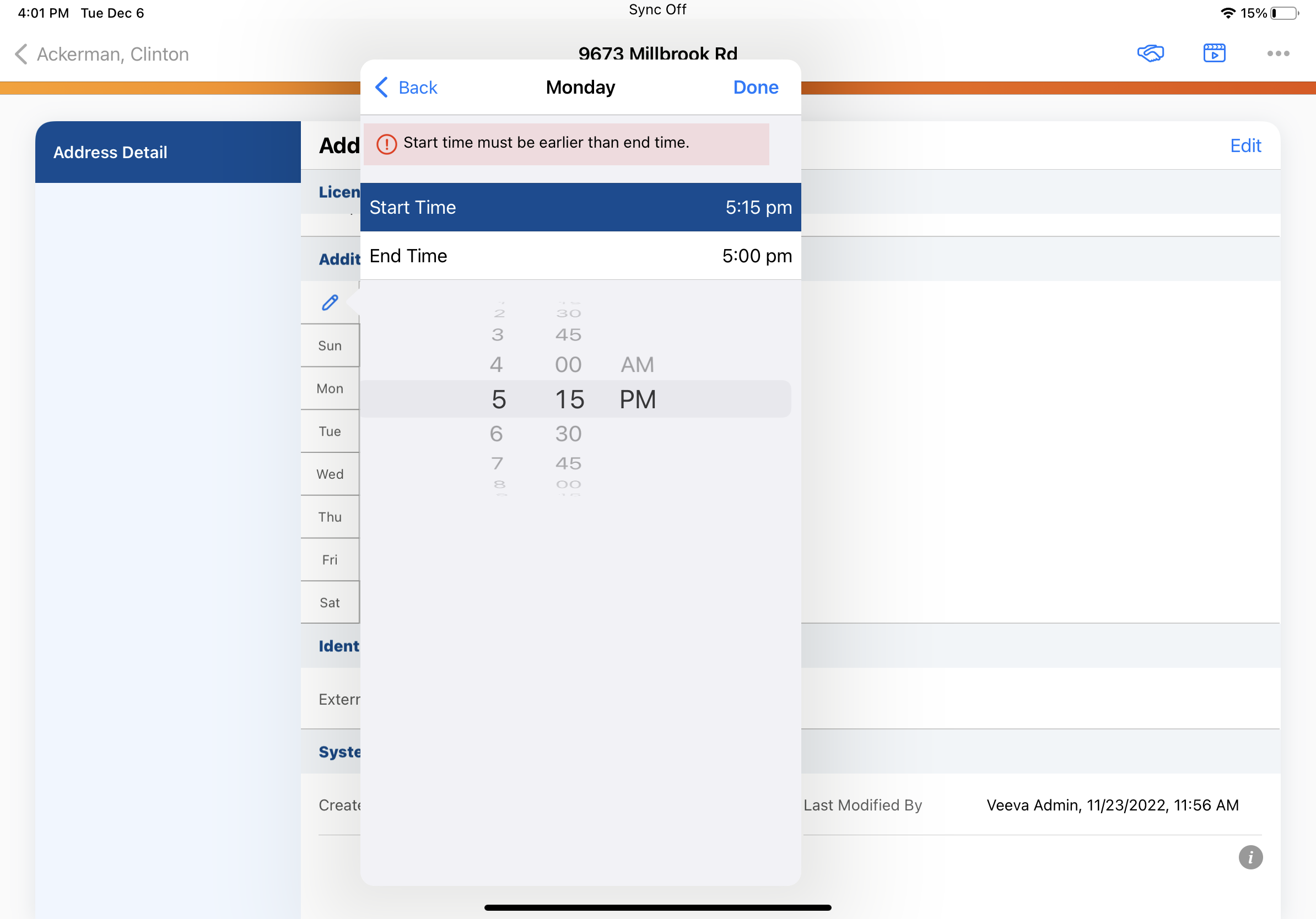
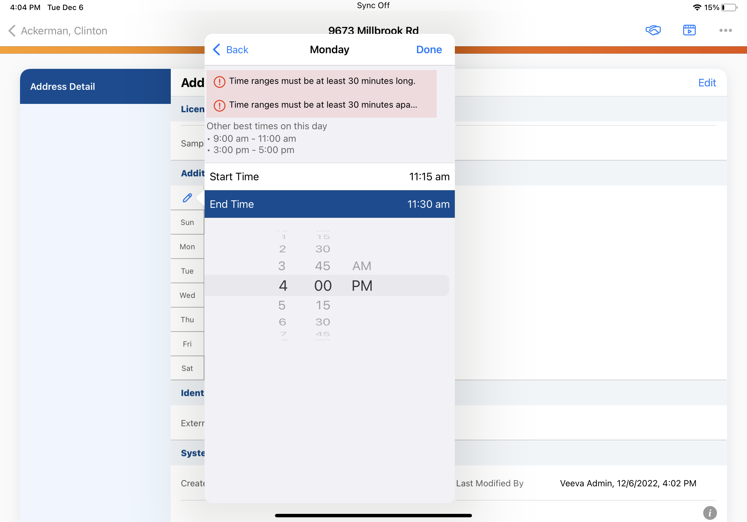
iPad |
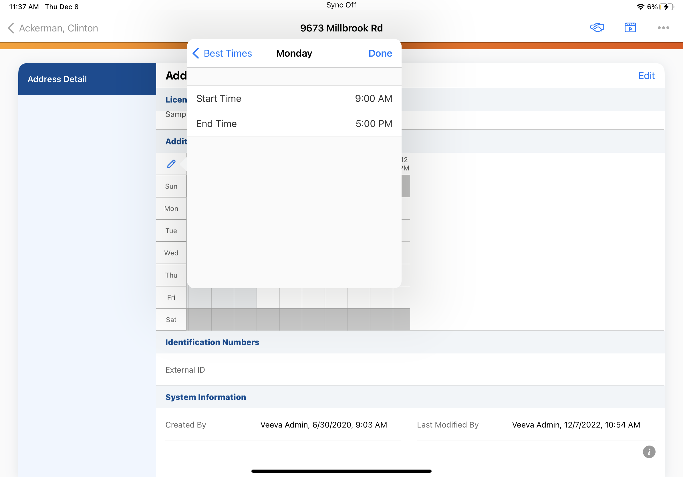
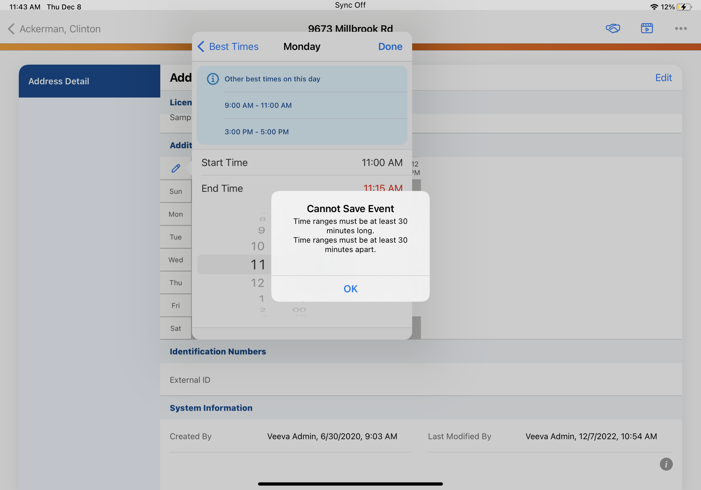
When users create or edit Office Best Times, warnings and other information impacting the user’s workflow are highlighted in an information box. |
|
|
|
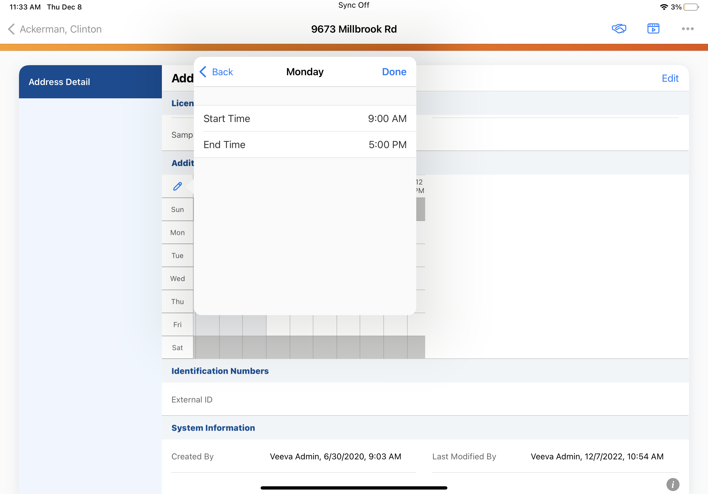
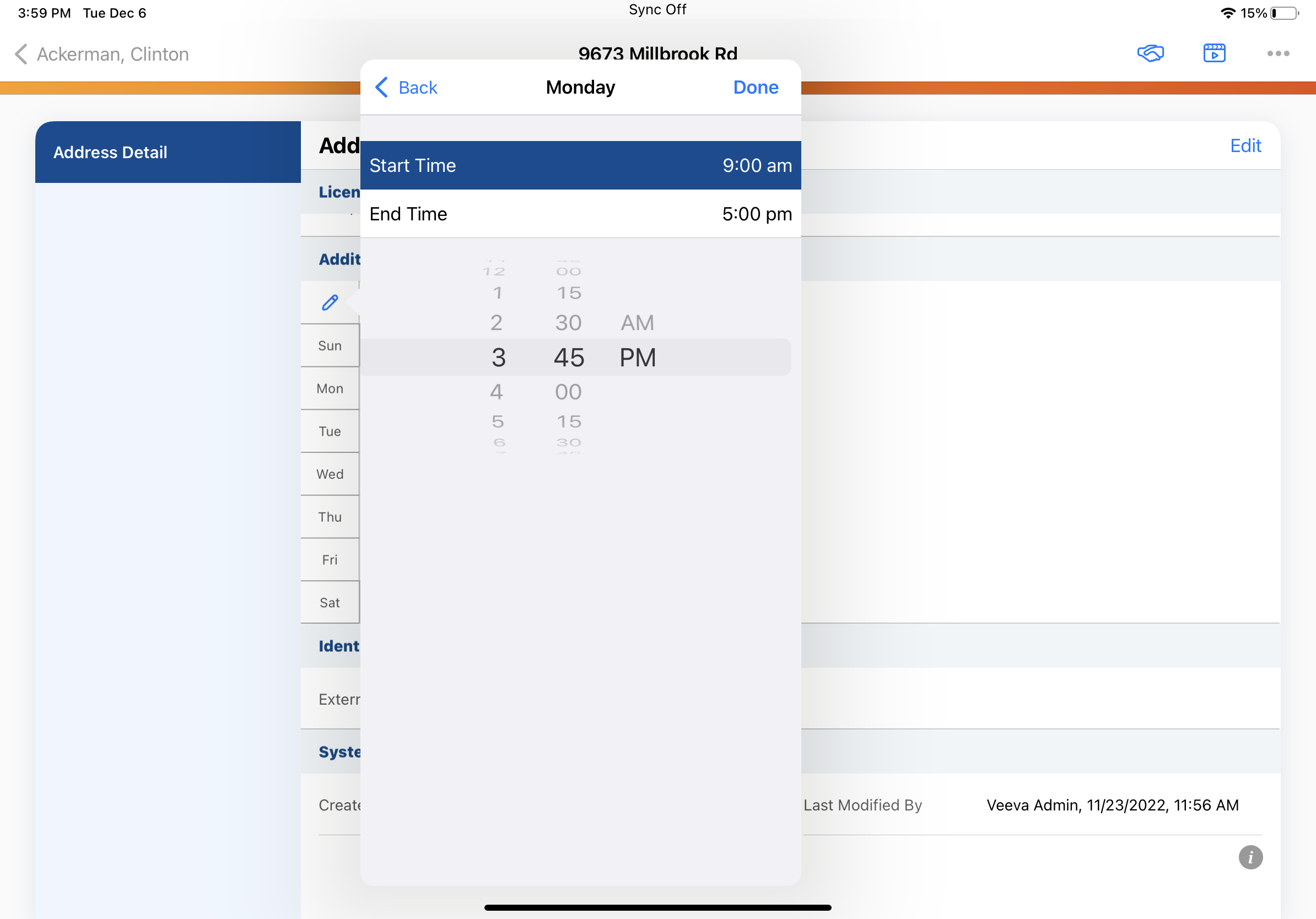
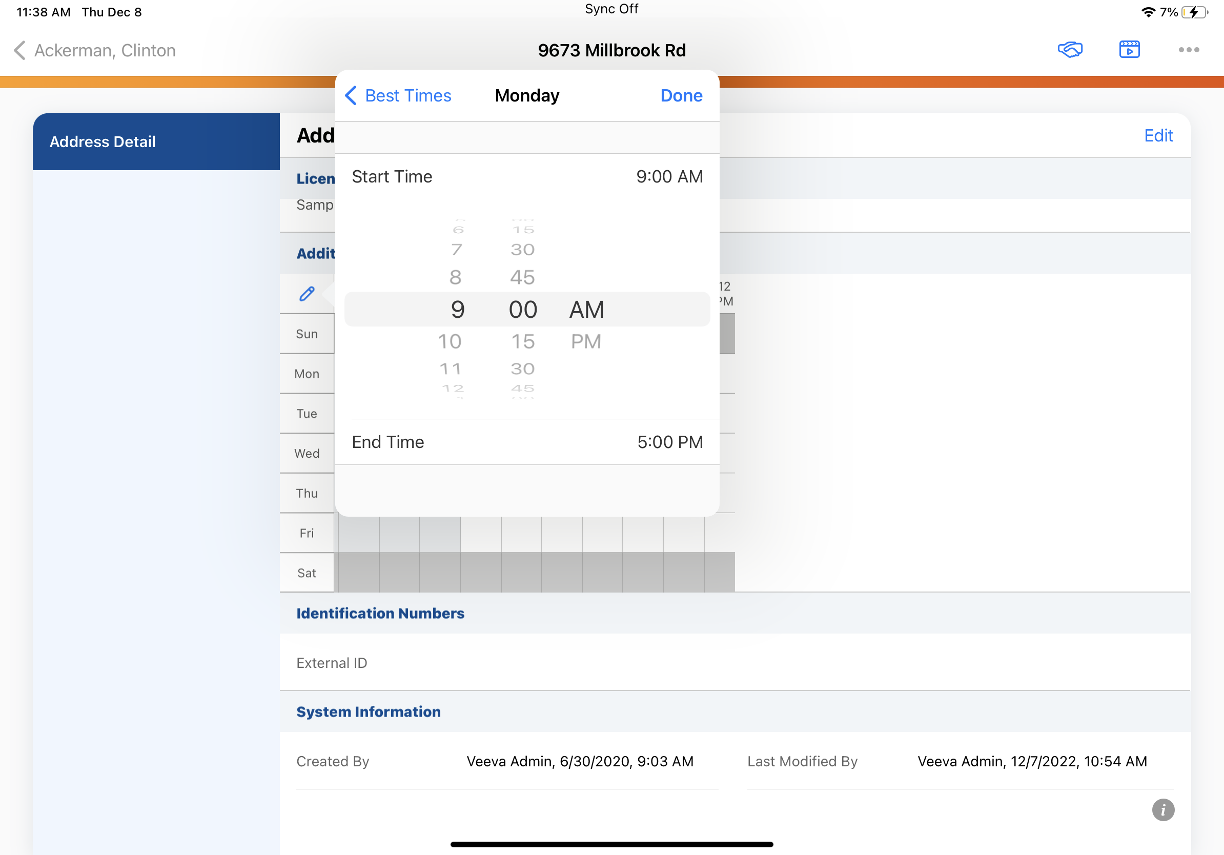
iPad |
The Start Time picker defaults to 9:00 AM and the End Time picker defaults to 5:00 PM, instead of defaulting to the current time. |
|
|
|
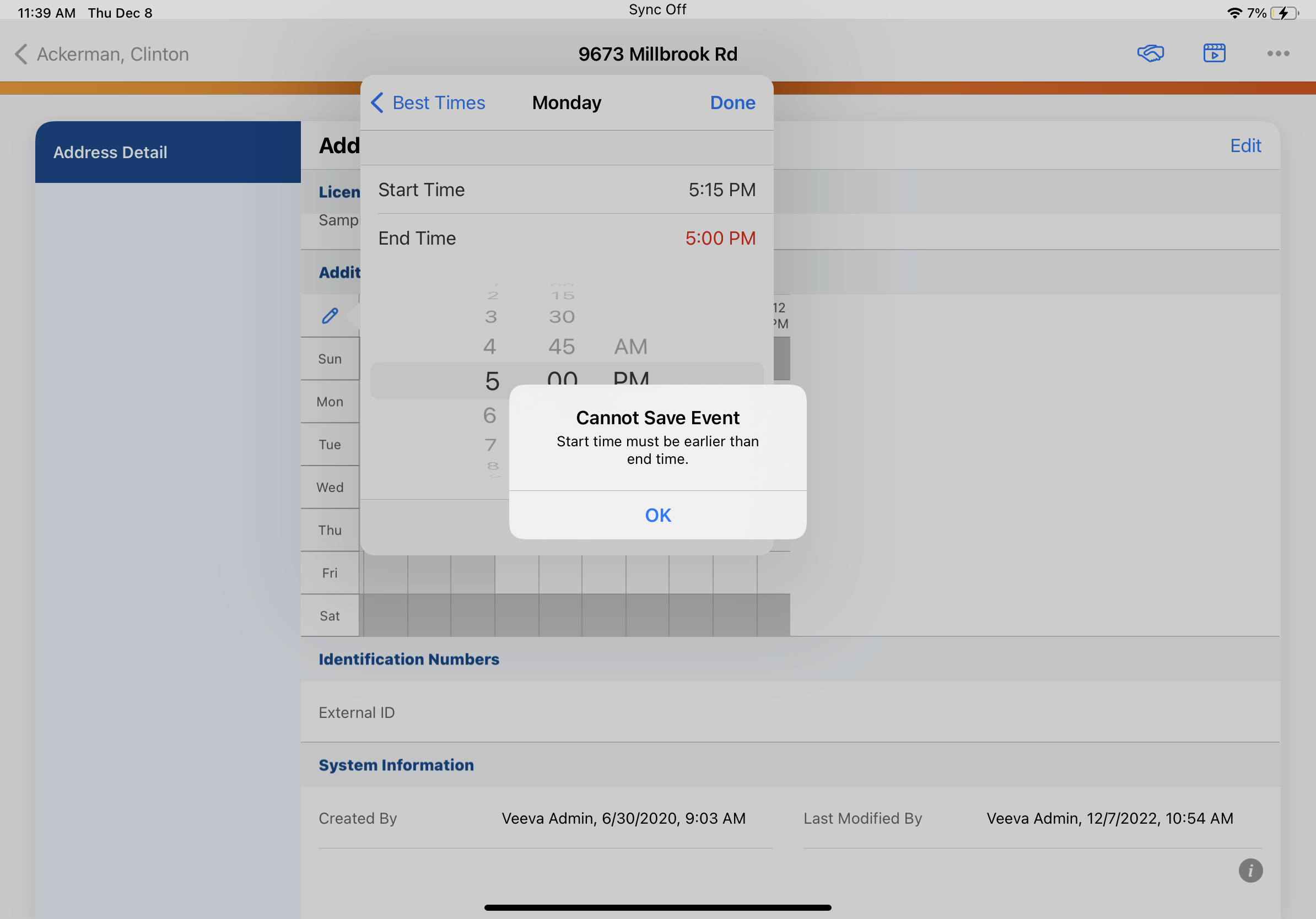
iPad |
When users enter an invalid start or end time for Office Best Times, the invalid time is highlighted in red and an error modal displays. |
|
|
| iPad |
For consistency in user experience, the user interface for the MCCP filters popover is updated:
|
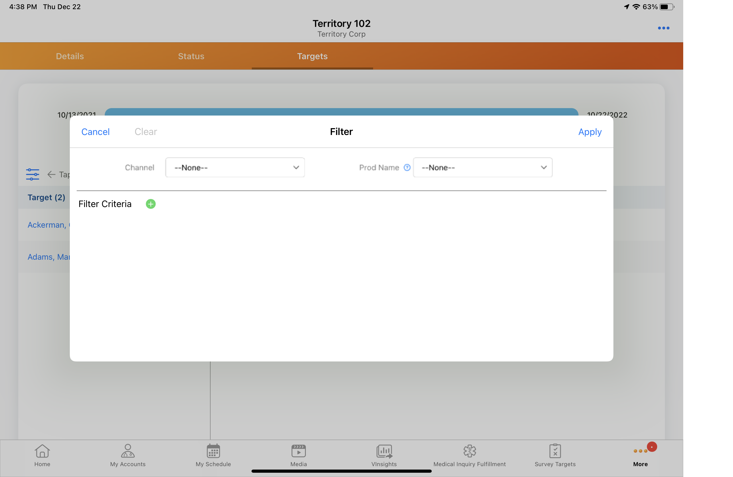
|
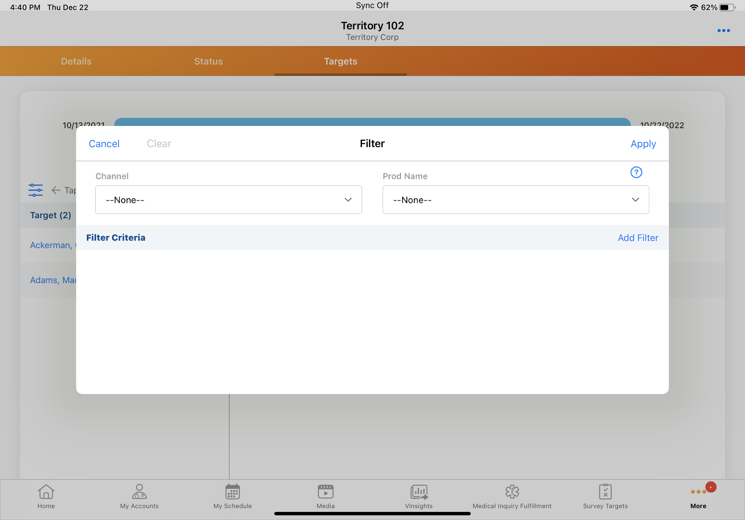
|
|
iPad |
When an error occurs while loading MCCP filter information, the error message displays in the center of the screen. To retry, users select a Retry link instead of an icon. |
n/a |
n/a |
223.0.100 (November 17, 2022)
| Platform | Description | Before | After |
|---|---|---|---|
| iPad | The list view for Templates displays with new styling to indicate which templates are selected. | 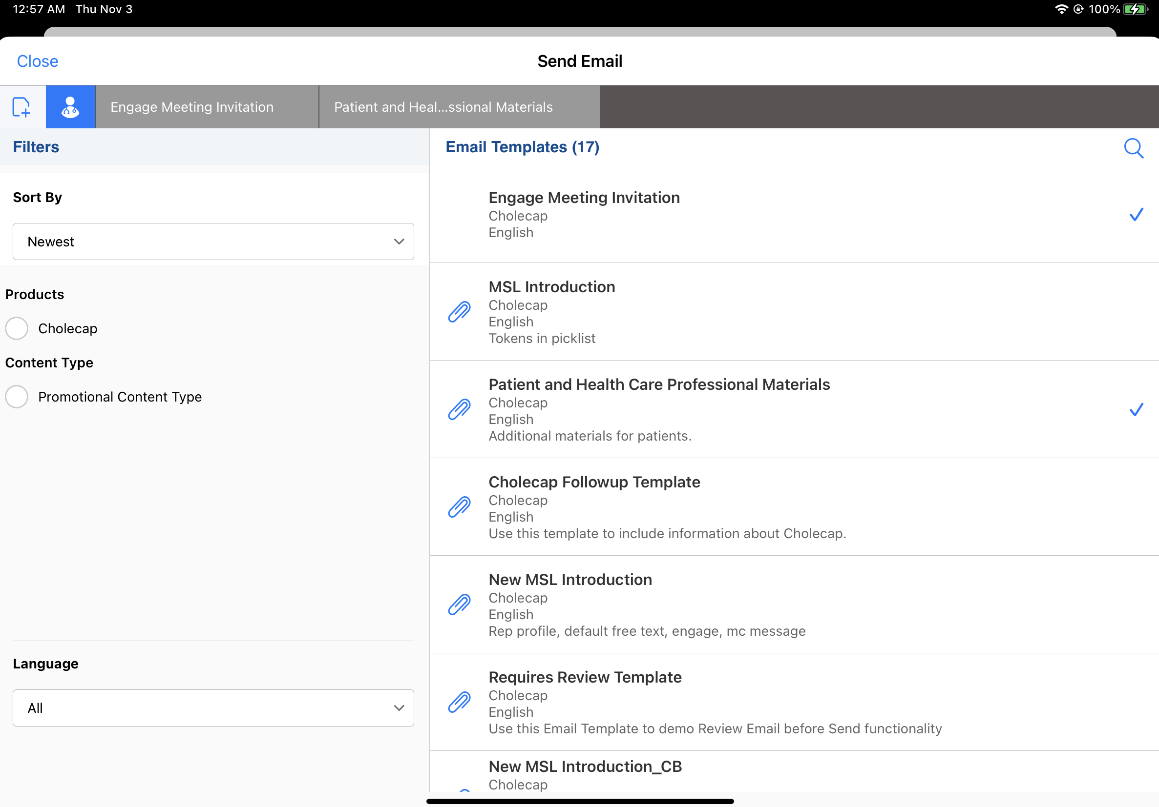
|
|
|
iPad |
The list view for Fragments displays with new styling to indicate which fragments are selected. |
|
|
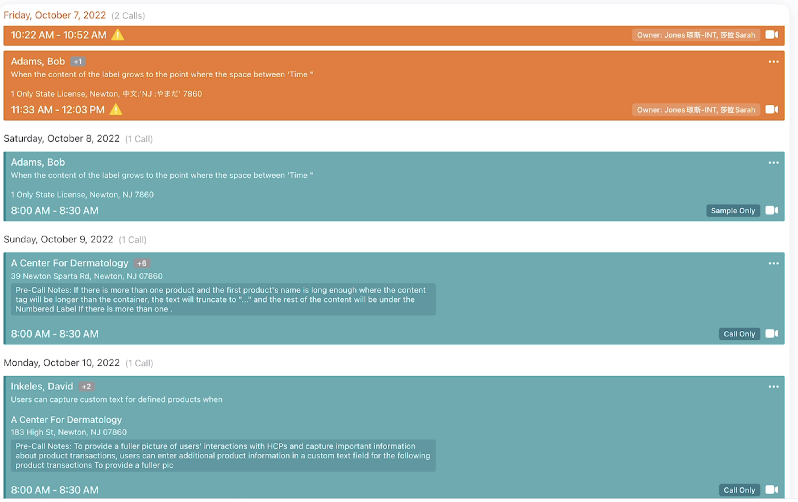
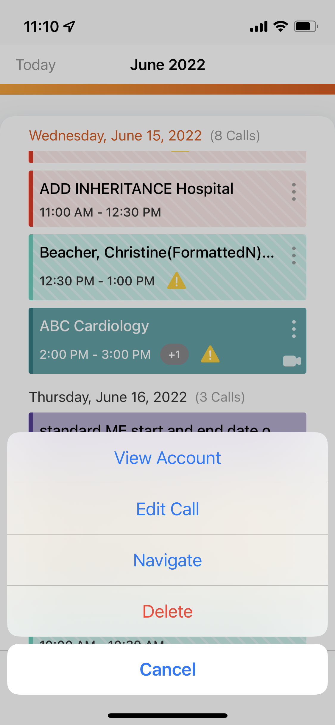
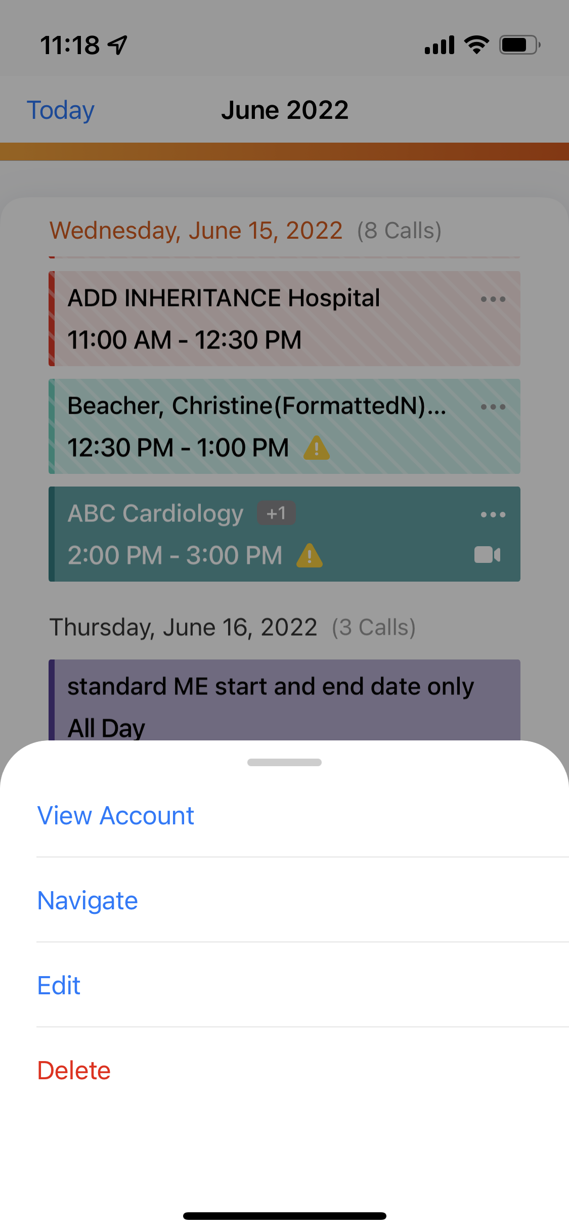
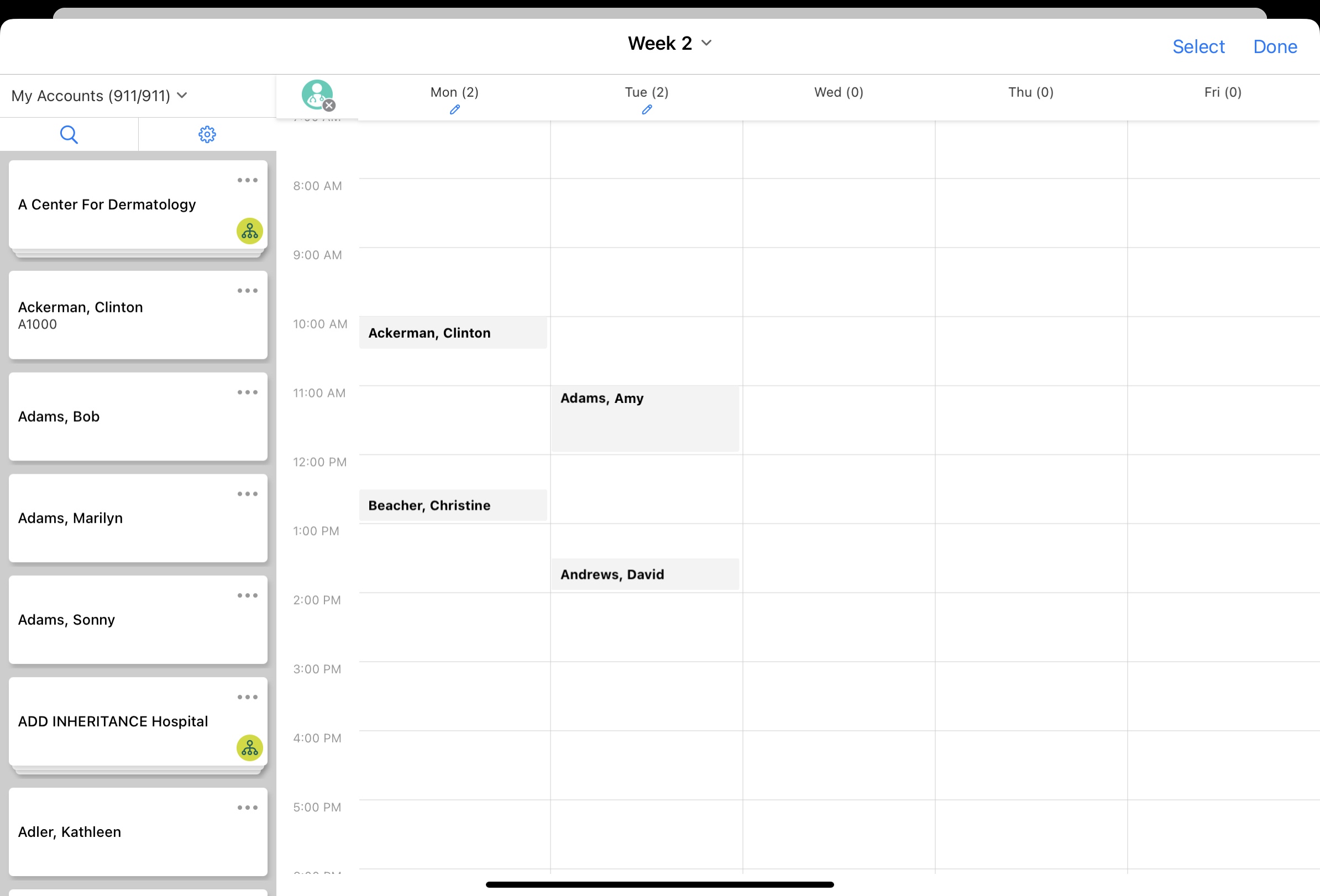
| iPad | In My Schedule’s Agenda View, the remote meeting indicator displays to the right of the call type label instead of displaying to the left. | 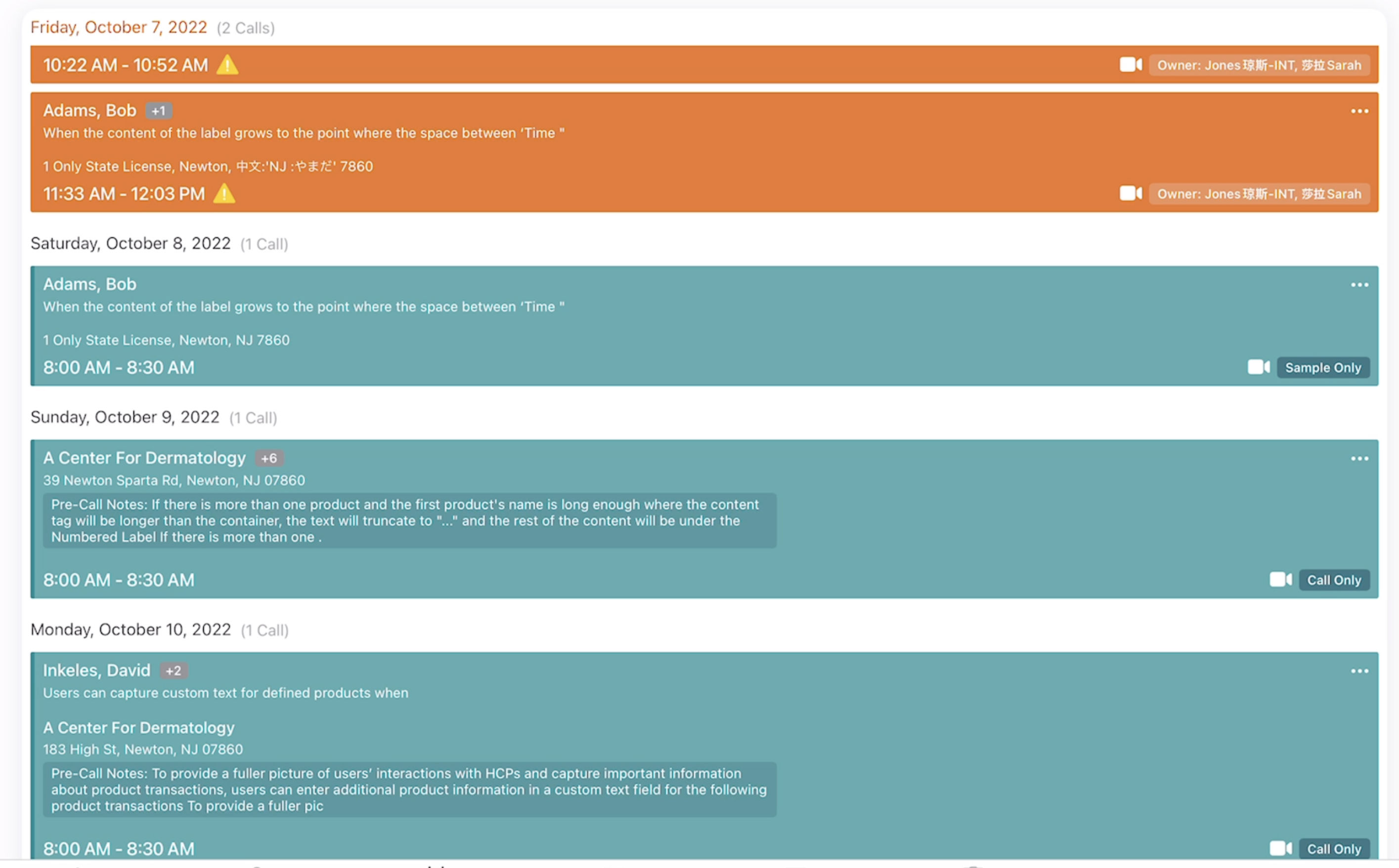
|
|
|
iPad |
In My Schedule's Week View, Cycle View, and Map View, users can scroll top to bottom from calls, Time Off Territory, and other calendar events instead of only scrolling from white space. |
|
|

222.0.100 (July 28, 2022)
| Platforms | Description | Before | After |
|---|---|---|---|
|
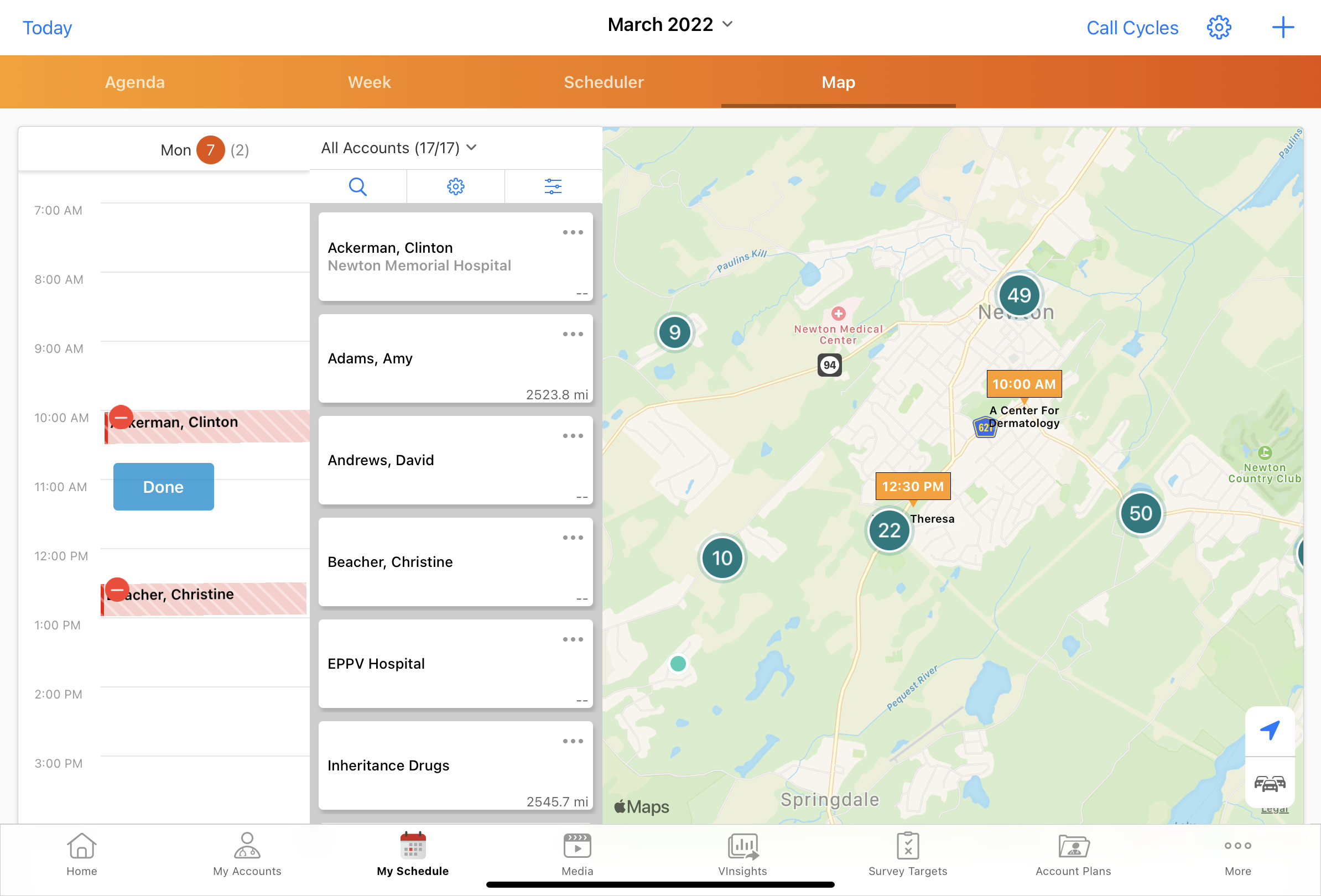
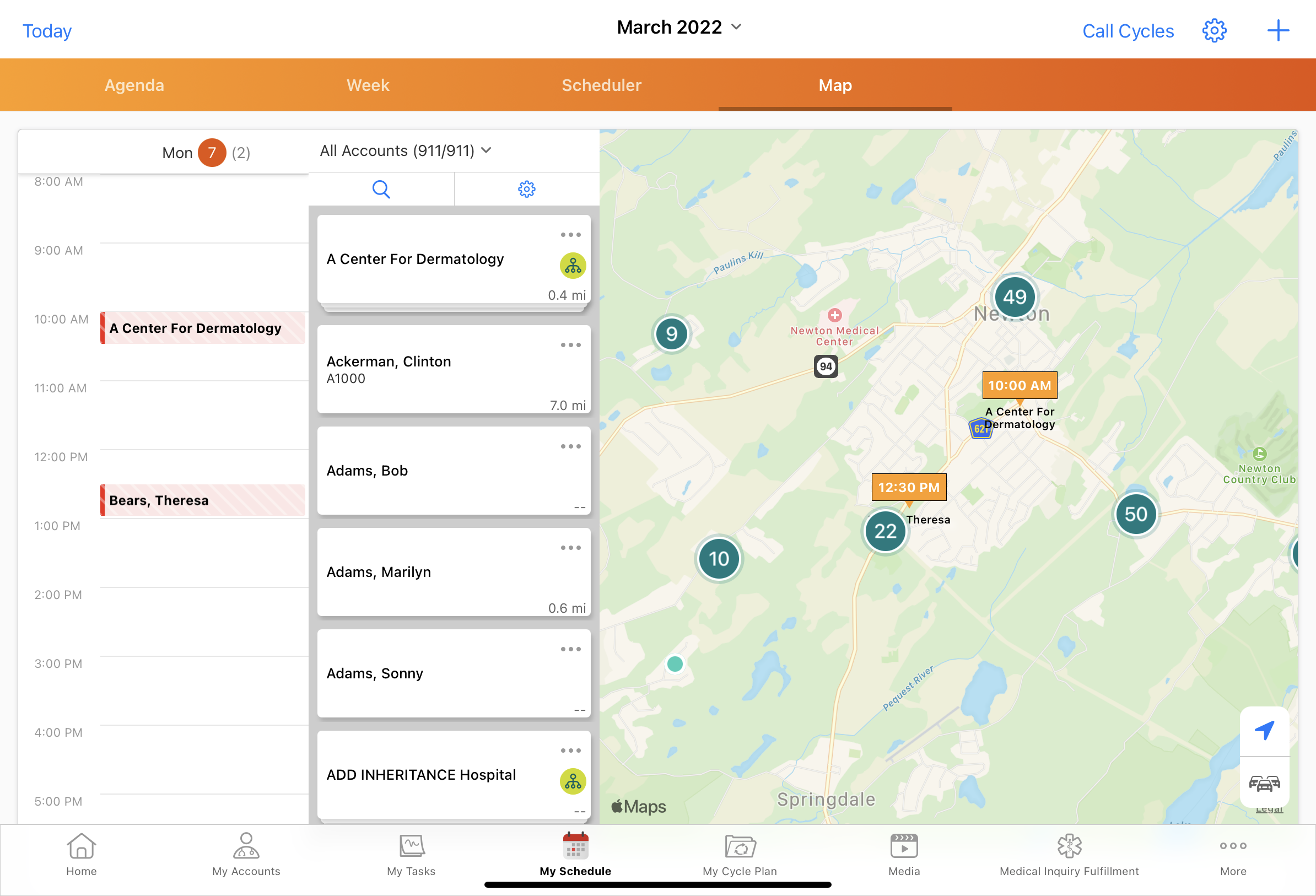
iPad, iPhone |
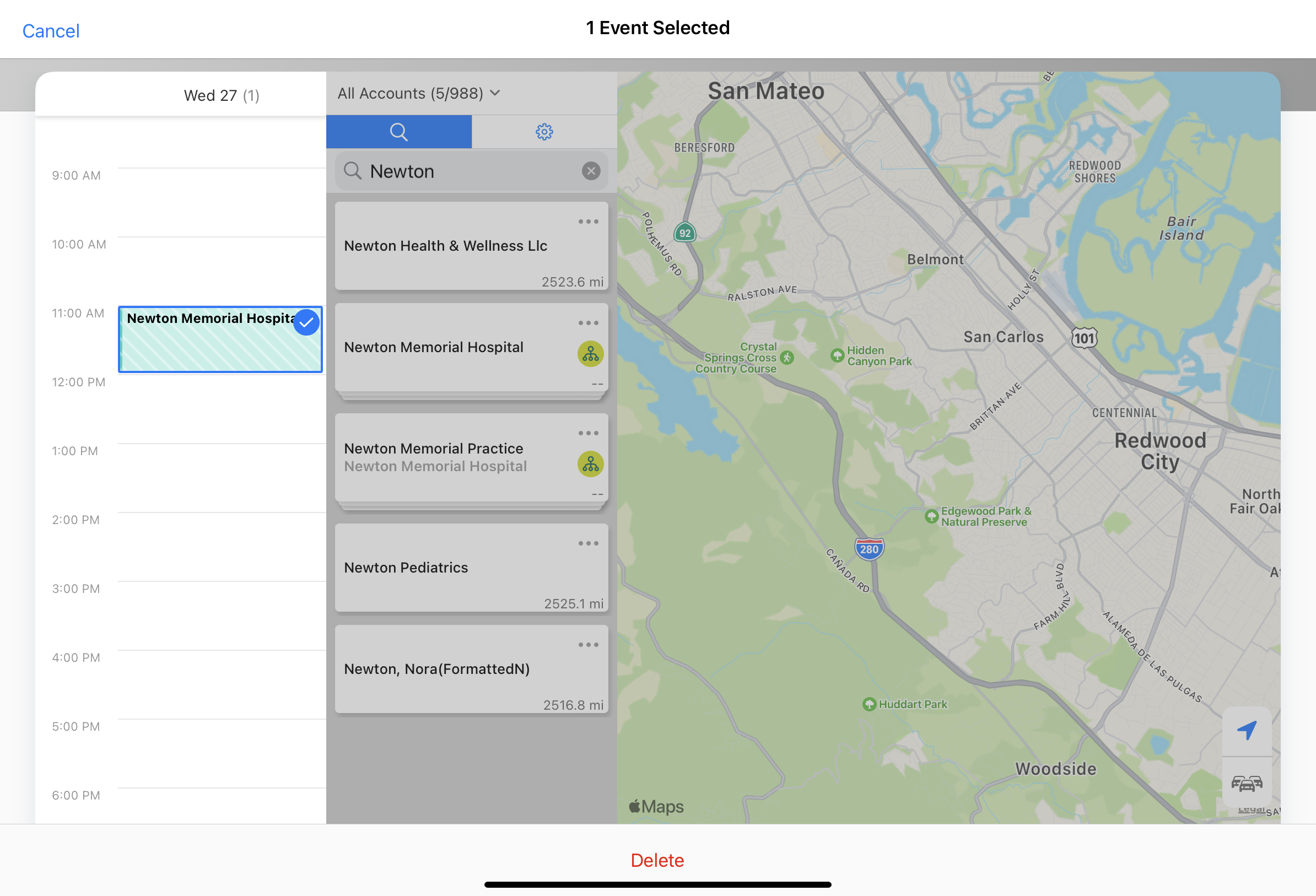
Users can delete calls from Map View using the Select button. To delete calls, users must have Delete OLS for the Call2_vod object. |
n/a |
|
|
iPad |
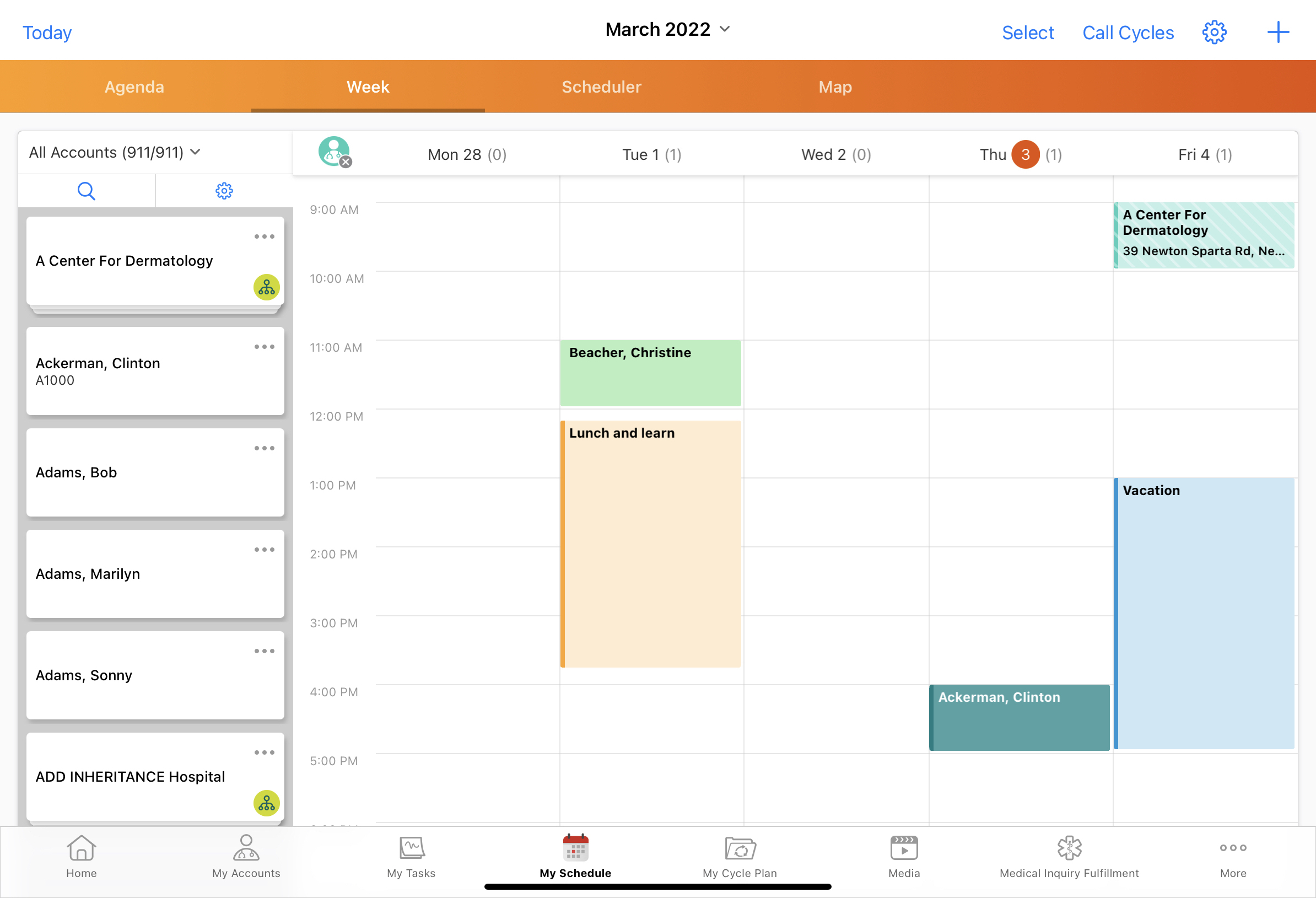
In Week View, Call Cycle View, or Map View, the following do not display in Select mode:
|
|
|
|
iPad, iPhone |
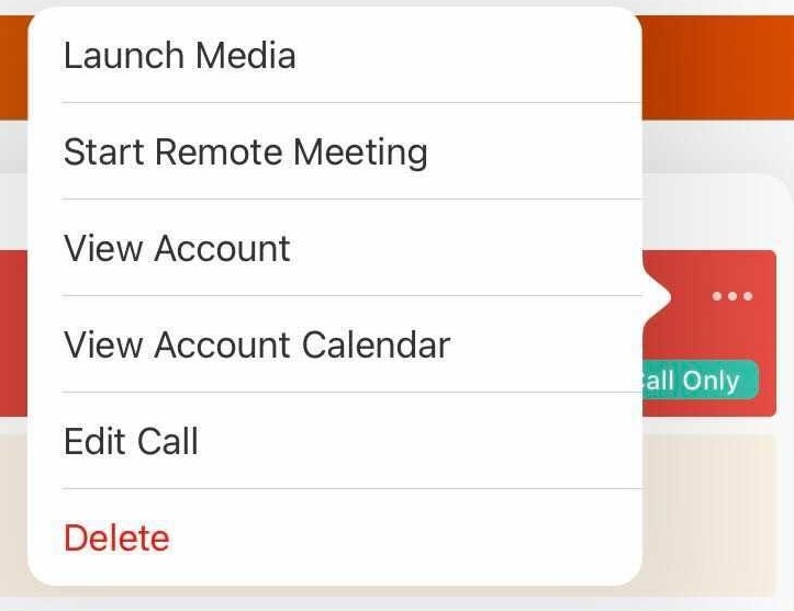
The Edit Call option displays as Edit. |
|
|
|
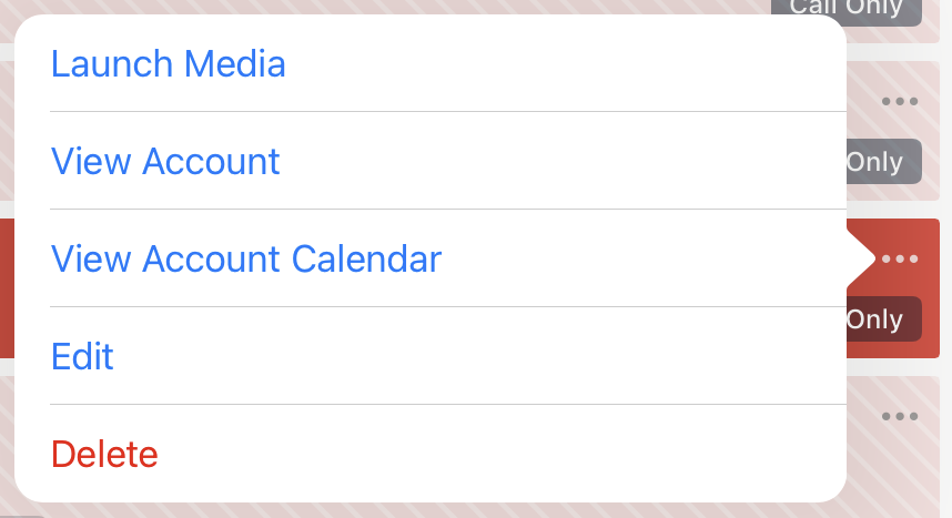
iPhone |
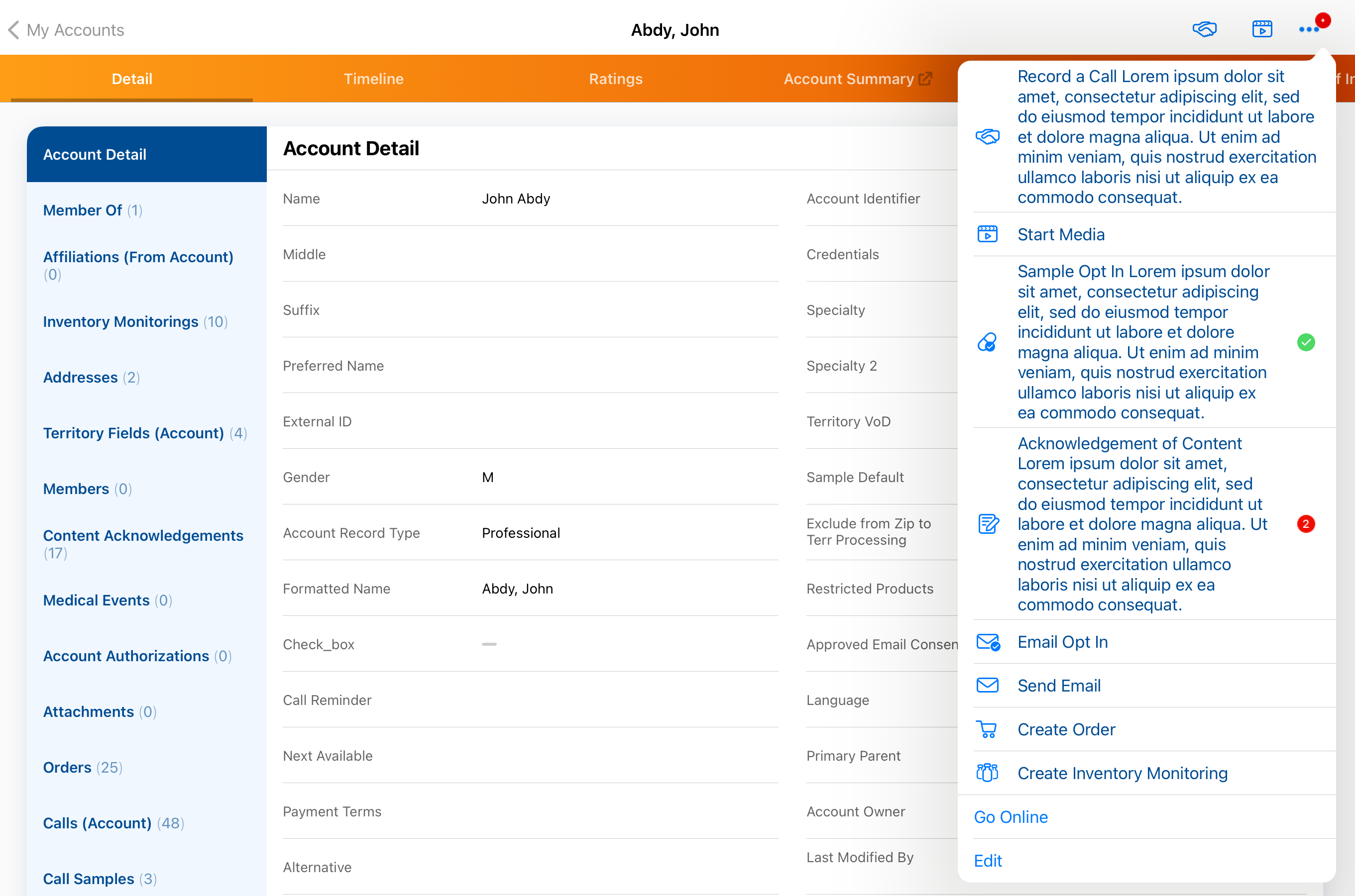
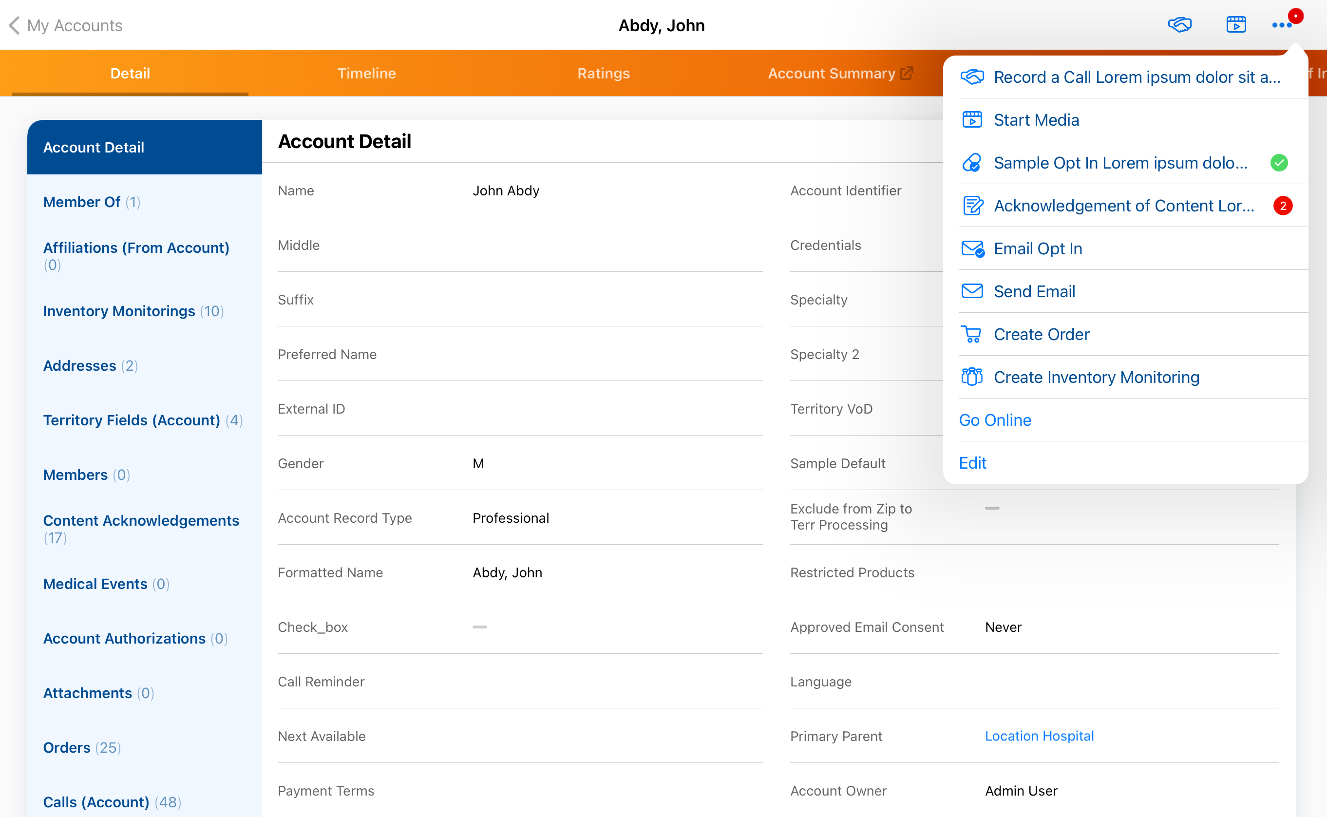
When users select More Actions from Agenda View, the More Actions menu is updated:
|
|
|
|
iPad, iPhone |
When users select the More Actions menu from Agenda View, actionable menu items are hyperlinked in blue. |
|
|
|
iPad, iPhone |
The tag identifying the call type is gray, instead of teal. |
|
|
|
iPad, iPhone |
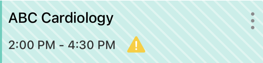
Call conflict icons are smaller in Agenda View. |
|
|
|
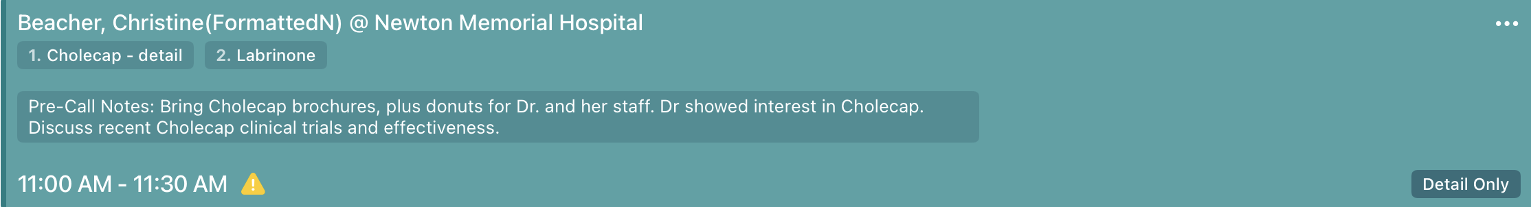
iPad, iPhone |
In Agenda View, pre-call notes display in a separate text field on the entry. |
|
|
|
iPad, iPhone |
The No Events placeholder displays in a darker shade of gray and the thin dark gray bar at the left of the No Events placeholder no longer displays. |
|
|
|
iPad, iPhone |
In Agenda View, unassigned presentations display in teal, rather than blue. |
|
|
| iPad |
In Week View, icons shrink to fit the entry’s height:
|

|

|
|
iPhone |
Times display in bold in Agenda View. |
|
|
|
iPhone |
In Agenda View, the More Actions icon is horizontal, instead of vertical. |
|
|
|
iPhone |
In Agenda View, the attendee count icon is rectangular, instead of circular, and it displays at the top of the entry. |
|
|


221.0.100 (April 14, 2022)
| Platform | Description | Before | After |
|---|---|---|---|
|
iPad |
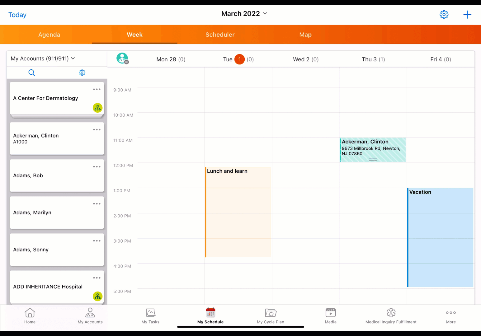
The colors of My Schedule calendar entries are updated with slightly different shades and increased opacity. |
|
|
|
iPad |
When users select a My Schedule calendar entry to view details, the calendar entry is highlighted in a darker shade of the original color. |
|
|
|
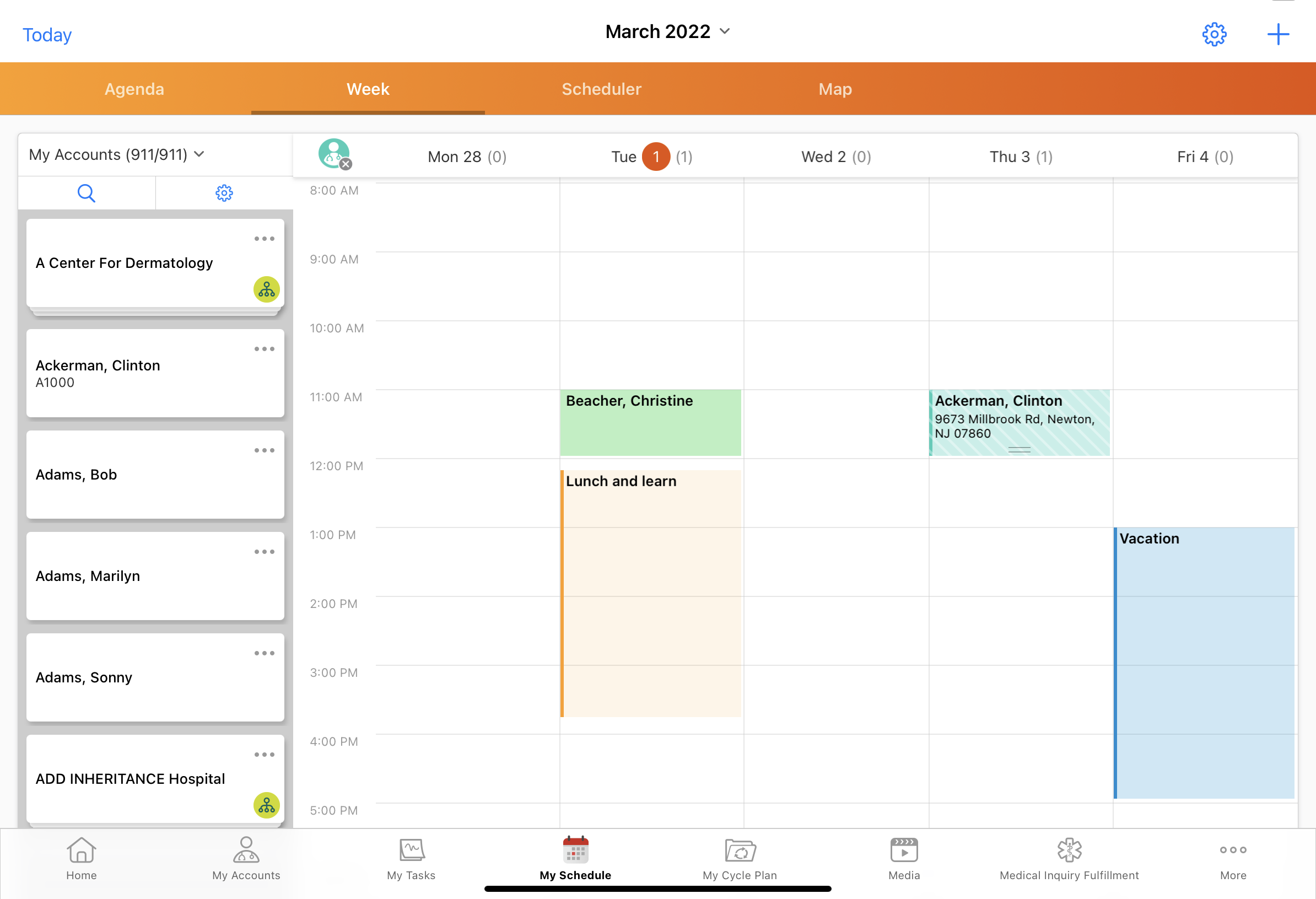
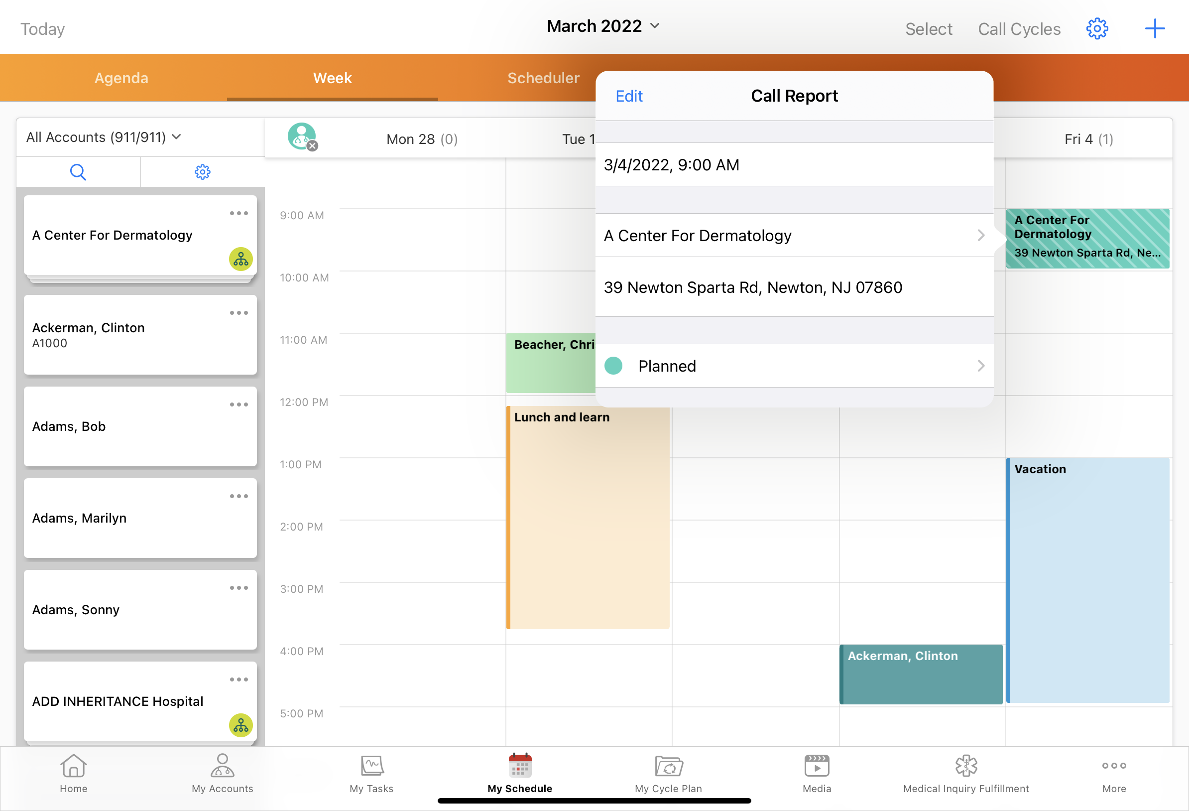
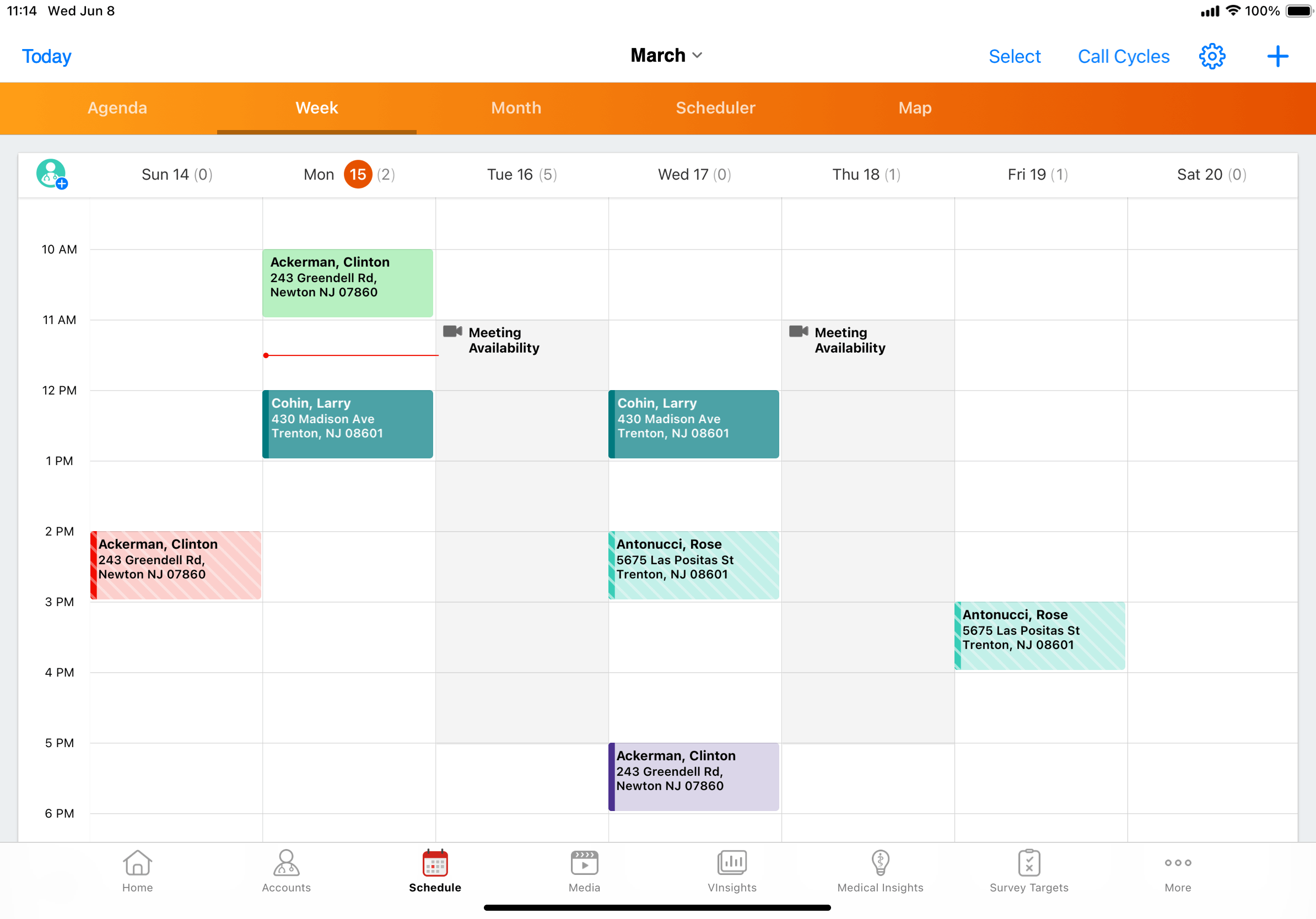
iPad |
To edit My Schedule calendar entries in Week View or from Call Cycles, select and hold the entry. Then use the white circles in the corners of the entry to modify the duration. Users can also drag the entry to another time slot or day. |
|
|
|
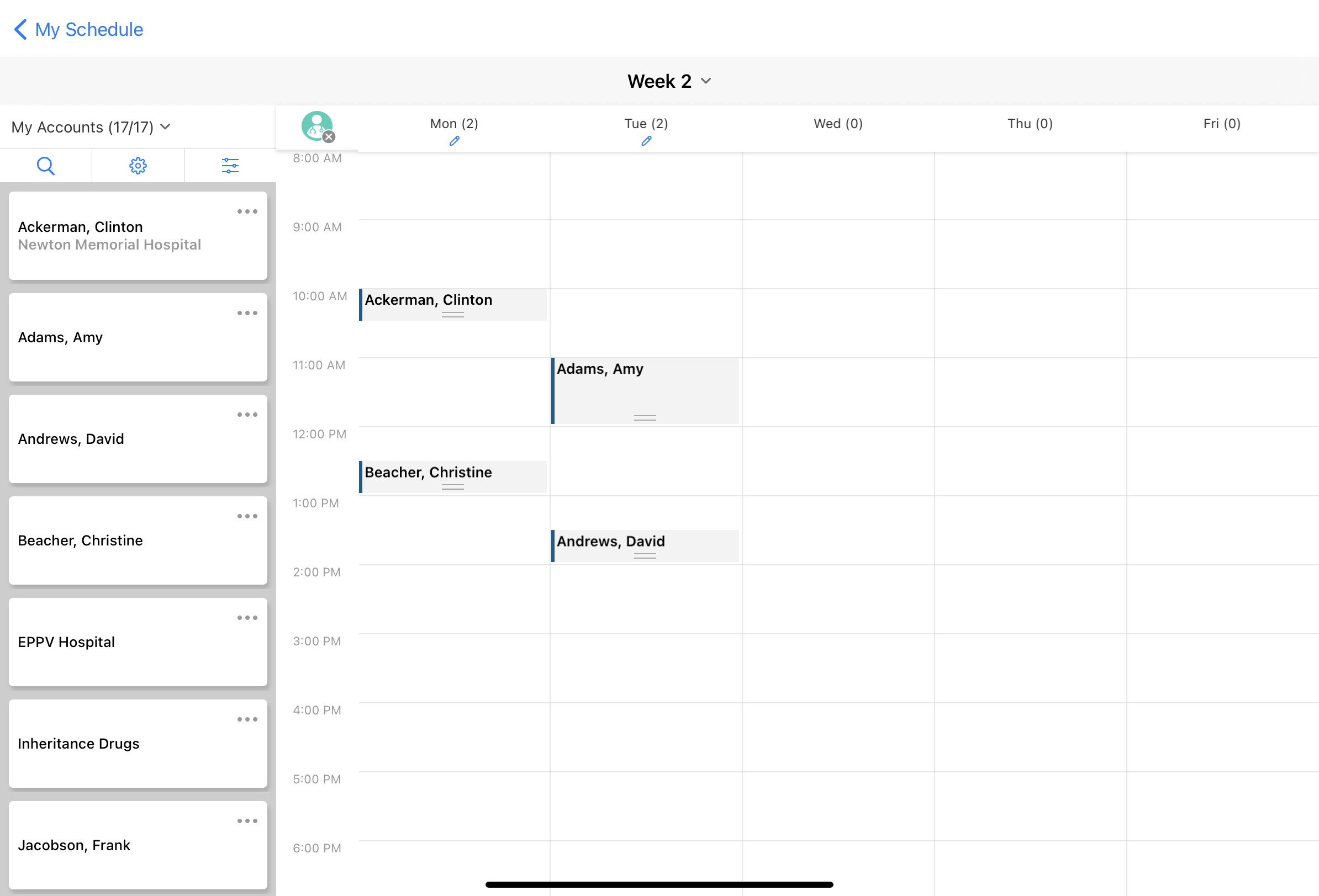
iPad |
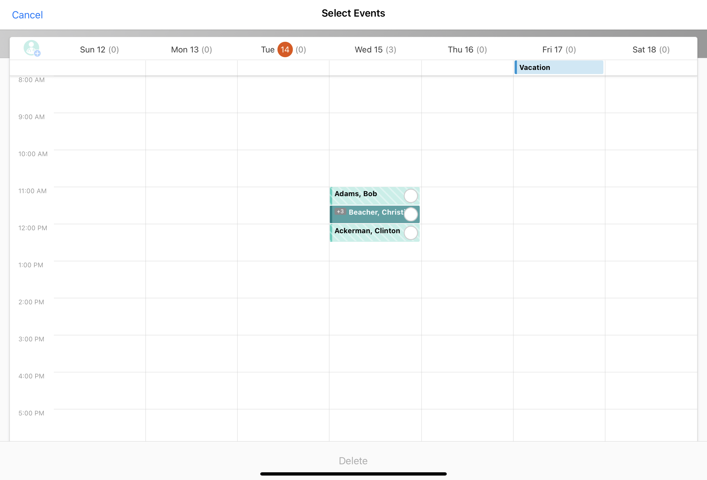
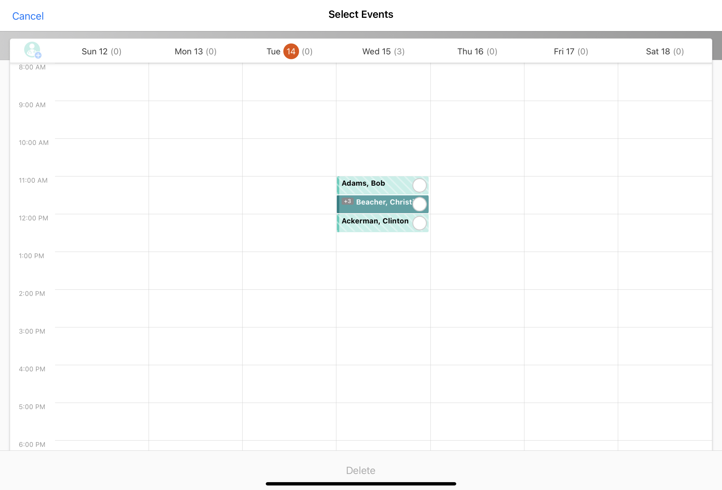
Use the Select button to delete multiple calendar entries at once in My Schedule’s Week View or Call Cycle View. Select the appropriate entries, then select the Delete button at the bottom of the screen. This replaces the previous mass delete mode. For more information, see My Schedule Week View. |
|
|
|
iPad |
Users cannot delete calls from My Schedule Map View. |
|
|
|
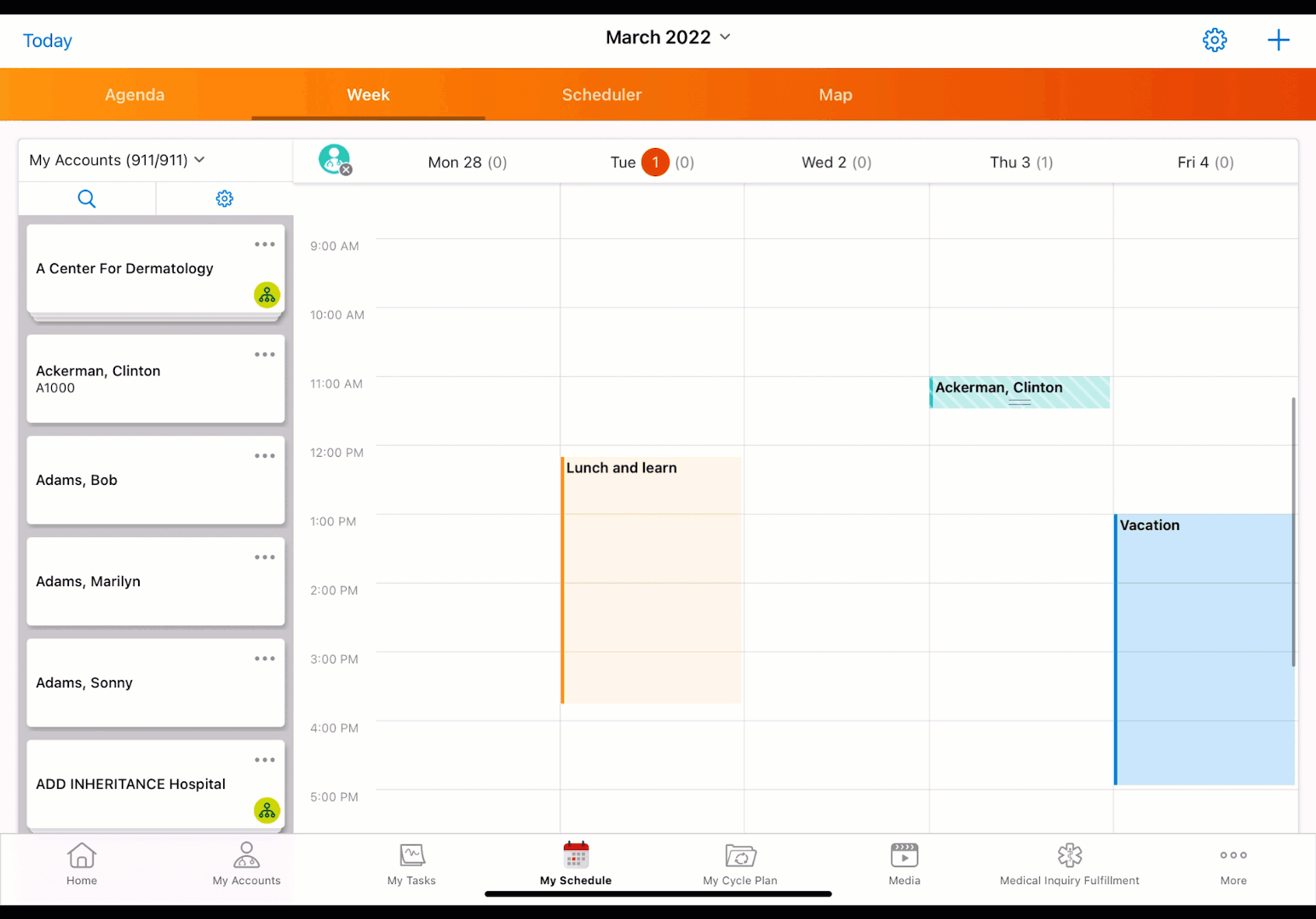
iPad |
When viewing call cycles from My Schedule, calendar entries display in solid gray. The blue sidebar does not display. |
|
|
|
iPad |
When users view call cycles from My Schedule, they must select the Done button to return to My Schedule. The back arrow does not display. |
|
|
213.0.100 (December 16, 2021)
| Platform | Description | Before | After |
|---|---|---|---|
|
iPad, iPhone |
If an item in the More Actions menu is longer than one line, it is truncated at the end of the line. |
|
|
212.2.100 (September 30, 2021)
| Platform | Enhancement Description | Before | After |
|---|---|---|---|
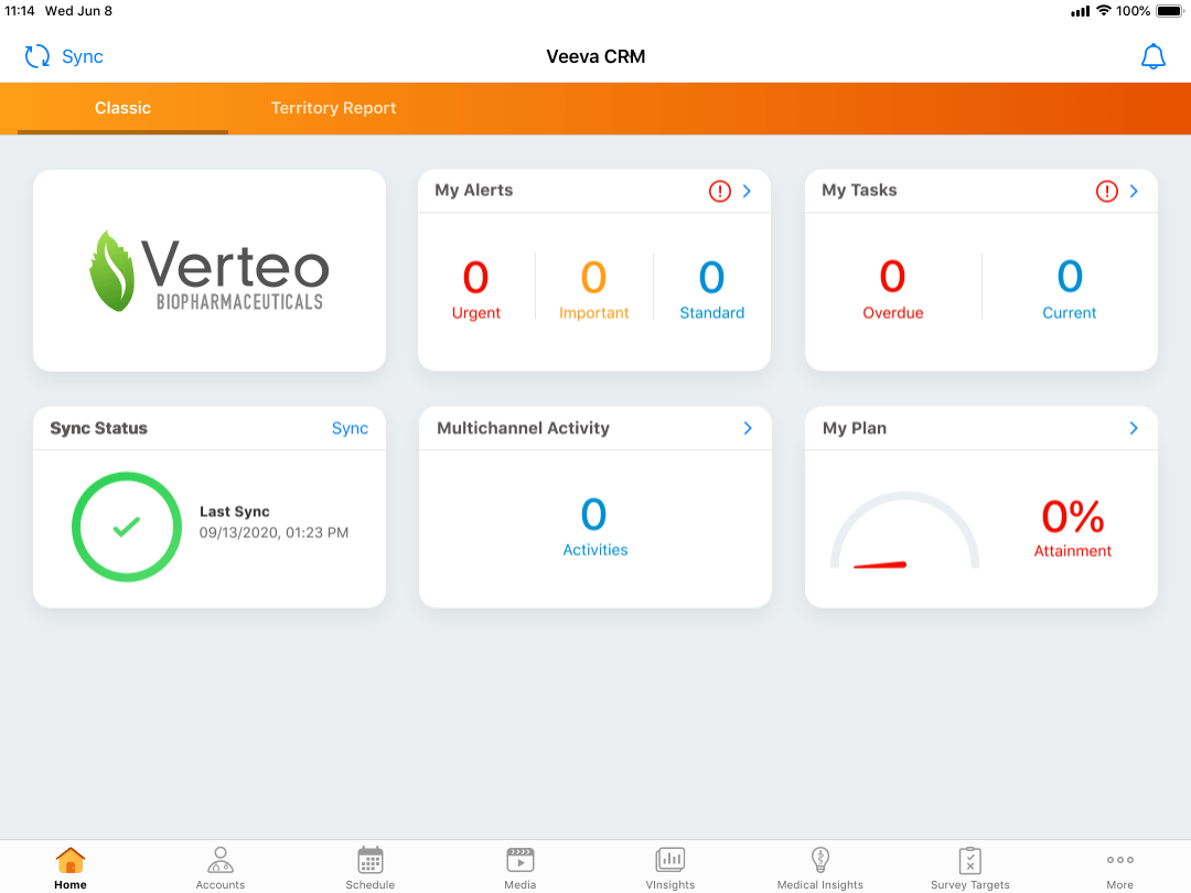
| iPad, iPhone |
Home page widgets are updated with the following. The widget functionality is unchanged:
Widgets expand to fill device viewports. In addition, status rings automatically resize to provide consistent spacing for 9.7 inch wide devices. |
|
|
|
iPad, iPhone |
New animations display for metric, sync, and gauge widgets. |
n/a |
|
|
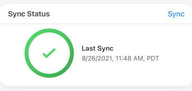
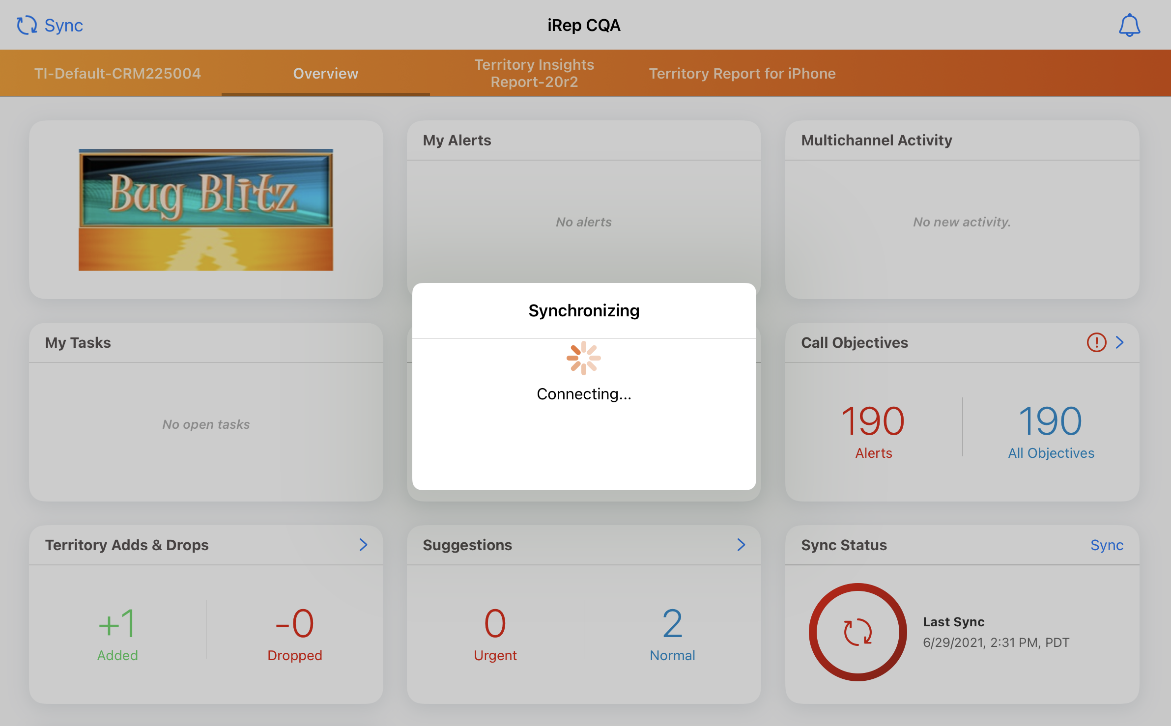
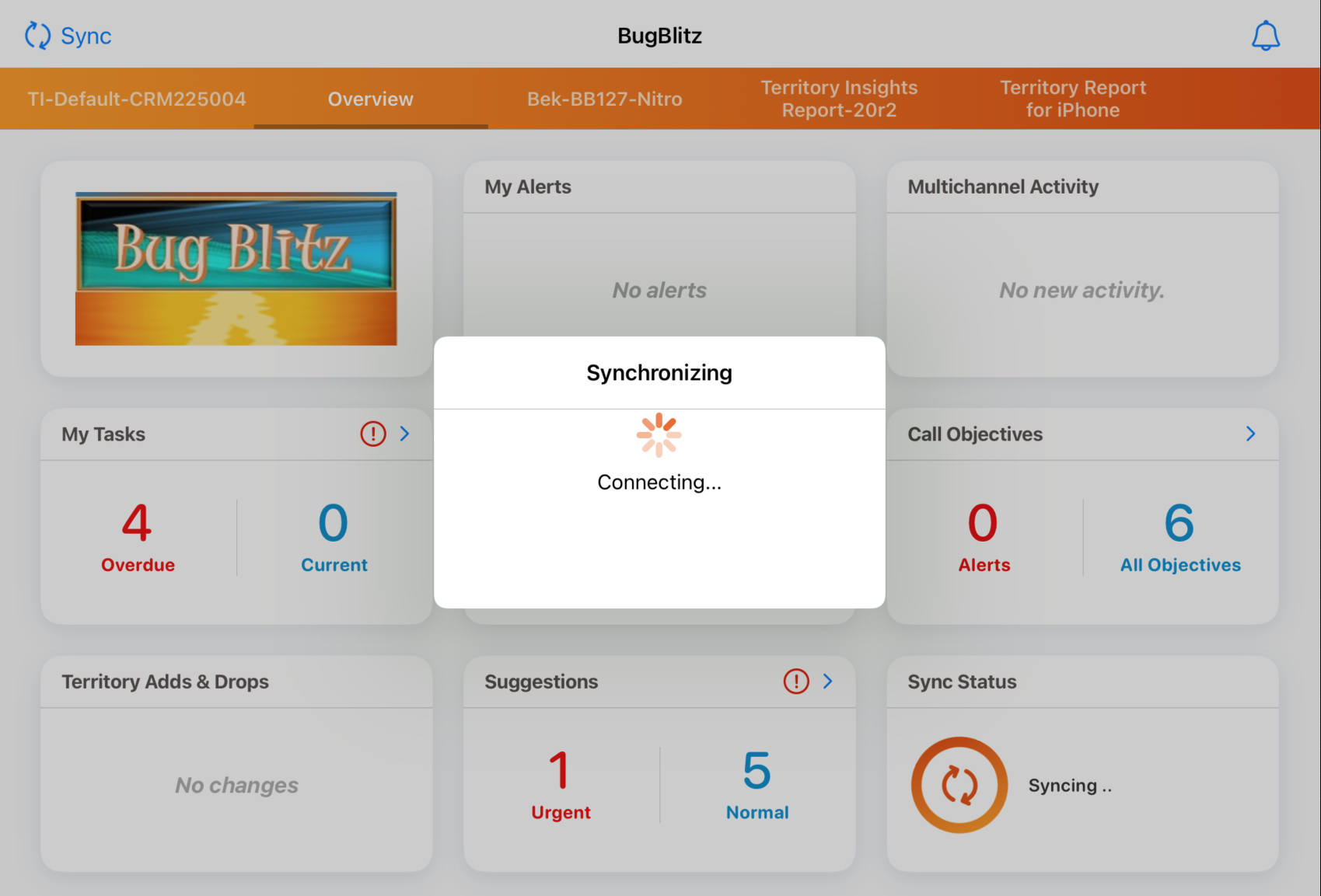
iPad, iPhone |
When users select the sync button, a syncing animation displays on the sync widget in the background. |
|
|
| iPhone | To effectively use available space, home page widget sizes are increased for edge-to-edge display. | 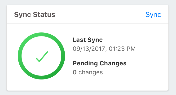
|
|
212.1.100 (August 26, 2021)
| Platform | Enhancement Description | Before | After |
|---|---|---|---|
| iPad, iPhone |
Cards throughout the Veeva CRM iOS apps are updated with 16-pixel rounded edges for a consistent, modern look. |
 |
 |
|
iPad, iPhone |
The background color throughout Veeva CRM iOS apps is updated to Salt (hex no. FAFAFB), a lighter shade of gray. |

|

|
|
iPad, iPhone |
To provide additional confirmation when users select an action in Veeva CRM, the following page level notifications display with audio confirmation:
|
See Audio for Page Level Notifications for a video and more information. |
|
211.0.100 (March 25, 2021)
| Platform | Enhancement Description |
|---|---|
|
iPad, iPhone, Windows |
Icons are updated with higher image resolution for Retina displays. Icon functionality remains the same. |
| iPad, iPhone, Windows |
The Classic tab on the Sunrise bar is relabeled on the following pages:
Tab display varies depending on user platform and existing configuration. |
|
iPad, iPhone |
Updates to the Sunrise bar improve efficiency and navigation in the Veeva CRM application. See Sunrise Bar Enhancements for more information, |
|
iPad, iPhone |
A secondary navigation bar enables users to scroll from tab to tab within a Contracts, Inventory Monitoring, or Order Management record. The bar does not collapse, regardless of the number of tabs. See Secondary Navigation Bar for more information. |
