

Navigational Guide for the Sunrise UI on iPhone
The new Sunrise user interface (UI) is now on Veeva CRM for iPhone. Available functional areas include My Accounts and My Schedule.
There are four main areas of the new interface:
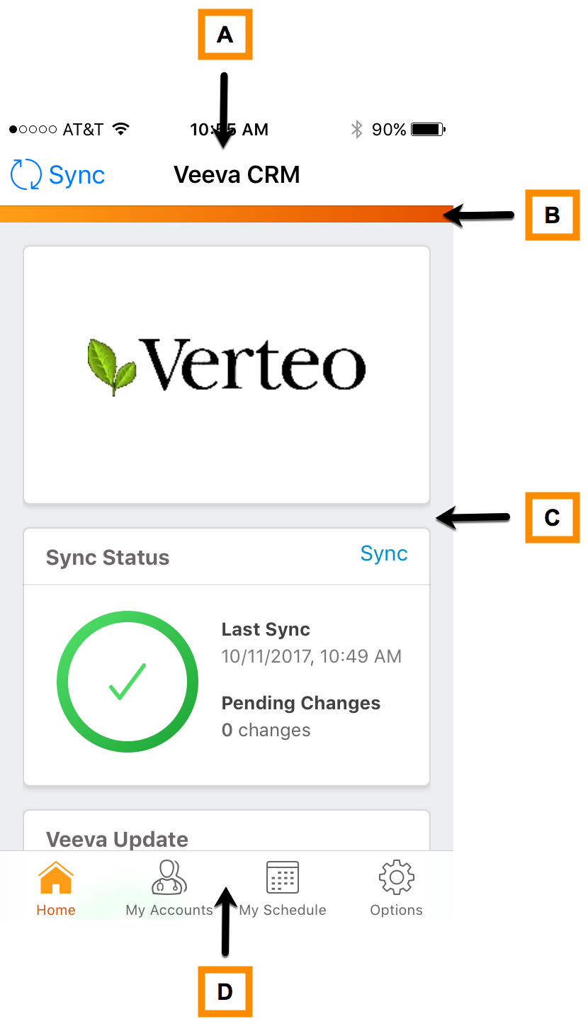
A - The Title bar displays at the top of every page and contains information about where you are within the functional area. This bar also provides options for actions you can take on the current view. For example, you can perform a Sync on the Home page, or you can Create a Call when you are viewing an Account.
B - The Sunrise bar displays for the main page of each functional area. When tabs are not present, the Sunrise bar displays in collapsed mode. When tabs are available, use them to navigate to other pages within the selected functional area. If multiple tabs are available, you can scroll left and right to display the additional tabs.
The Sunrise bar displays in full when the current page is at the top. If you scroll down more than one page in length, the Sunrise bar collapses to allow more space for other activities on the page. As you scroll back to the top, the Sunrise bar expands.
C - This is where your main content displays for each functional area.
D - The Main Navigation bar displays at the bottom of the screen and displays for the home page in each functional area. The icons in this bar have two different states: they display orange when you select the icon to indicate you are viewing information for the functional area selected. The icons display white when another icon is selected. Selecting Home always displays the home page with cards.
Buttons, Icons, and Pills
With the new Sunrise UI, there are also some new icons and other elements you need to be familiar with.
| Icon | Definition | Example of Where used |
|---|---|---|
|
Action
|
When you select this button, a list of actions display associated with the current view in the main content area. |
When you select this button in the Call Report, you have the option to Save the Call, Submit it, or Cancel the Call. |
|
Create
|
When you select this button, a new record is created for the current view in the main content area. | When you are viewing a specfic Account, you can select this button to create a new Call. |
|
More Actions
|
Selecting this icon displays a list of additional actions associated with the specific element in the current view in the main content area. |
If you are viewing your schedule in MySchedule, you can select this icon to view the Account for that Call, view the Call, or cancel the Call. |
|
Filter
|
Selecting this button displays a pop-up with filtering options for the current view in the main content area. | When viewing Accounts you can select this button to display the current view by a predefined View or List. |
|
Active Filter
|
This button displays with a green check mark in the corner when a filter is currently active for the list being viewed in the main content area. You can select the icon to change the filter or view the content without a filter. |
In Accounts you can view Accounts by Target List. |
|
Pills
|
With a successful Save, the green pill displays and then fades away. If you have errors on the page, the red pill displays indicating how many errors you have. The pill continues to display providing information about the errors you need to fix.. | If you select Save from the Action button on a Call Report but you forgot to select a date, the red error pill displays with a 1. You can select the pill and view the error. |
|
Question Mark
|
Select the Question Mark to learn more about that specific field in the main content area. |
Call Report - Mobile ID field in the Professional Information section for the Account |
|
Info
|
Select the Info icon to learn more about the content in the current view. | The Survey for Chilton Memorial Hospital does not launch. Selecting the Info icon on the Survey Target page provides you the necessary information needed to create a support ticket. |
|
Back button
|
Use the Back button to navigate back to the top level. The Back button navigates back one page at a time. | Any page where the button displays. |
|
Sync
|
Select the Sync button to send data to the online app and receive updated data and configuration changes. Syncing ensures you have the latest data. |
The button displays on the Home page with widgets providing you with information about the Sync. See Options. |


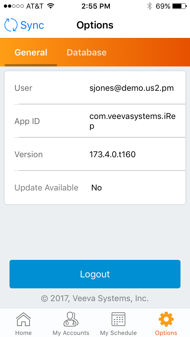
Options
Options are accessed via the Main Navigation bar at the bottom of the page. Options provide information related to sign-in and application versions as well as detailed information about sync. Options is divided into two sections: General and Database, and are displayed using the Sunrise Bar.
Options - General
Information in this section is used to communicate to support if there is an issue with the application and if an update is needed.
Options - Database
In addition to refreshing the database, Database settings provide information about your org and the sync function.
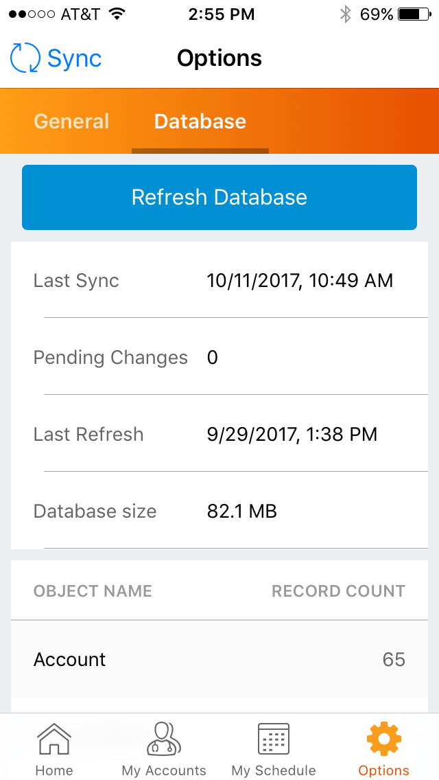
A full database refresh is the equivalent of downloading a new database.
Sync
Sync allows you to send all your data to the online application and receive all data and configuration changes. You need an active internet connection to sync. If a sync has not been performed in a certain number of days, you may be prompted to do a sync. Select the Sync button in the upper left corner of the Options page to initiate a sync.
The Sync Status widget on the Home page provides additional information about your org and the sync function:
- Green - No pending changes
- Orange - Pending Changes
- Red - Sync Warning based on the last time you did a sync.
See Sync Overview for more information about the Sync functionality.
