Updating Veeva CRM on Windows Desktop
The Veeva CRM Desktop app for Windows is now the Veeva CRM app on Windows Desktop. The media library and media player in the app are updated to have a better native Windows look and experience.
Profile Icon Menu
The Log Out and Quit Veeva CRM buttons now display in a dropdown menu when users select the profile icon in the title bar.
![]()
Side Panel
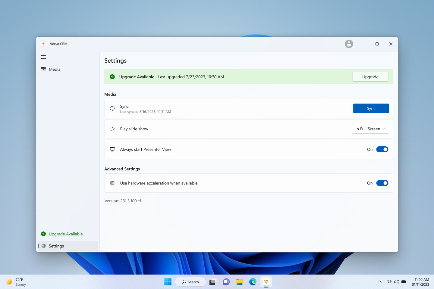
Users can expand and collapse the left side panel using the hamburger button in the top left corner. The panel is expanded by default. The Settings button displays in the bottom left corner.

When users collapse the side panel, quit the app, and sign back in, the panel displays expanded again.
Settings Menu
The Sync button now displays in the Settings menu.

Creating Custom Presentations
Users now select the + button in the top right corner to create a custom presentation.

Labels and Filters
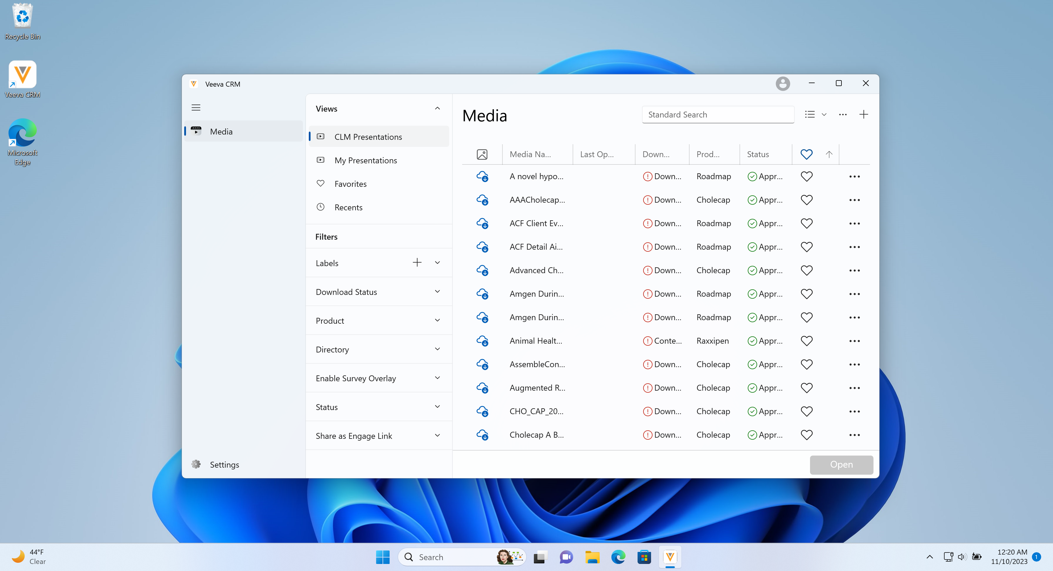
Labels and filters now display in a column next to the list of presentations.

Users can select the plus (+) button beside Labels to create and manage their labels.

Media Views
The available media views display in the Views section, including:
- CLM Presentations - all available presentations
- My Presentations - custom presentations
- Favorites - presentations marked as favorites
- Recents - up to 50 of the most recently viewed presentations, ordered from most to least recent

Switching Between Table View and Grid View
Users can switch between table and grid view using the dropdown menu next to the search bar.

Managing Columns in Table View
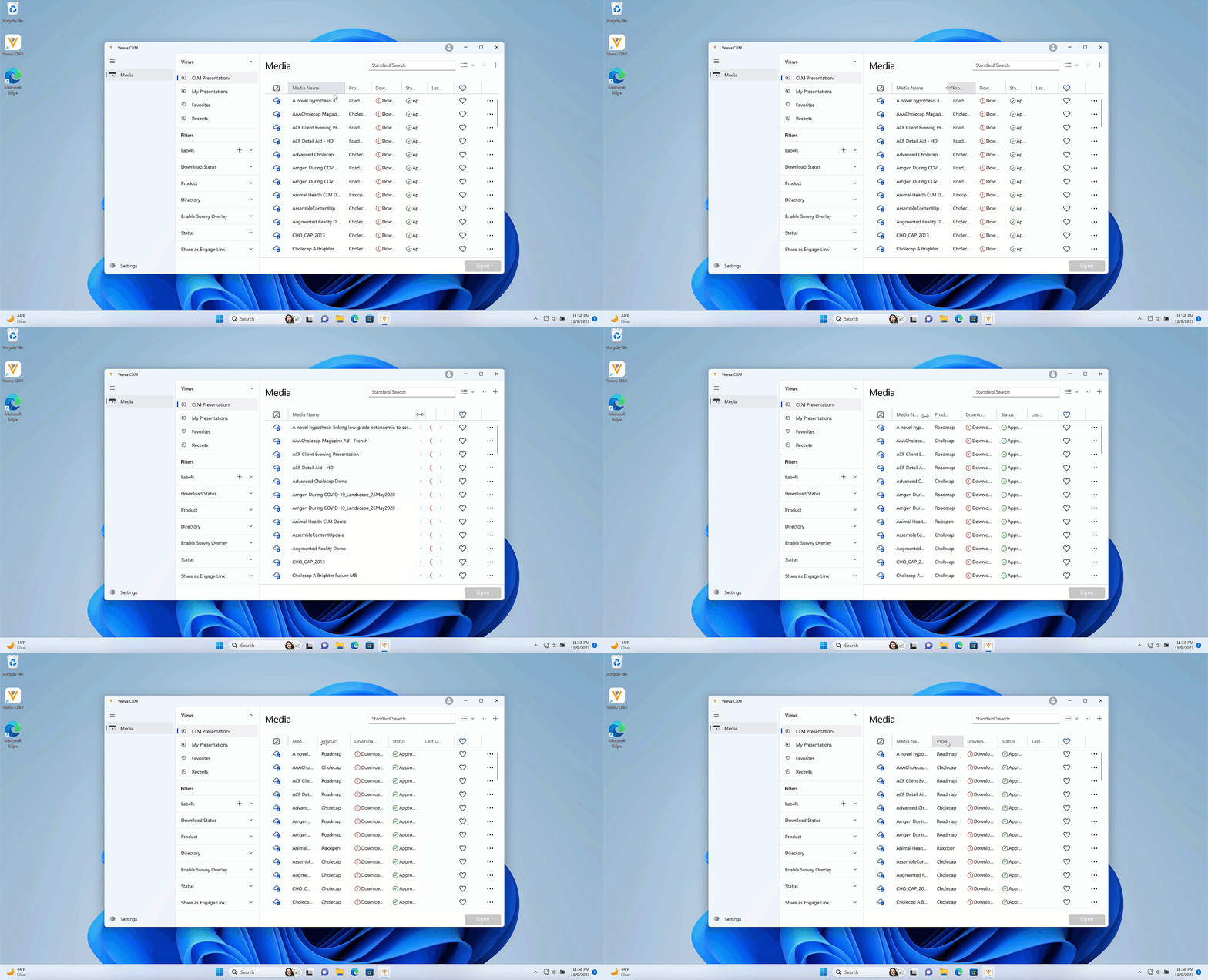
Users can resize the columns in table view by selecting and dragging the column dividers.
The following columns cannot be resized:
- Thumbnail
- Favorite
- More Actions
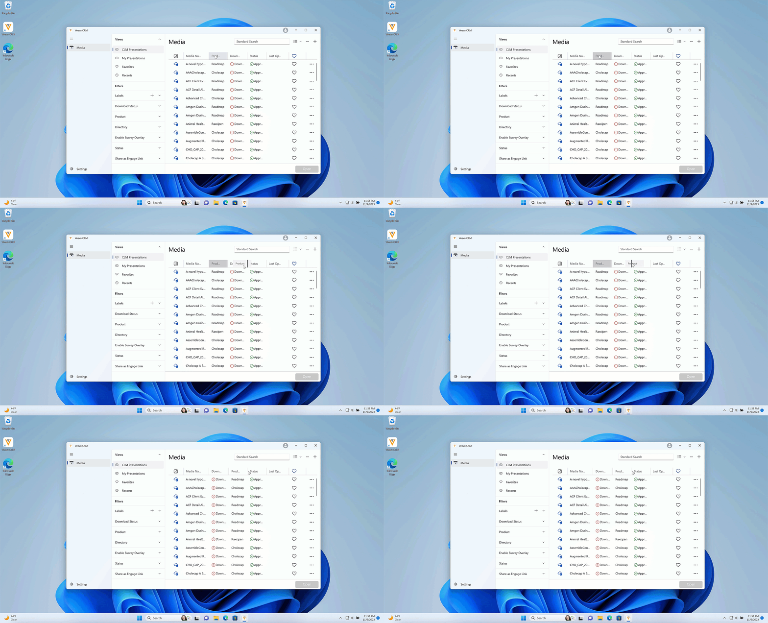
Users can reorder the columns by selecting and dragging columns.
The following columns cannot be moved:
- Thumbnail
- Name
- Favorite
- More Actions
When users resize or reorder the columns, quit the app, and sign back in, the columns display in the default size and order.
Normal View
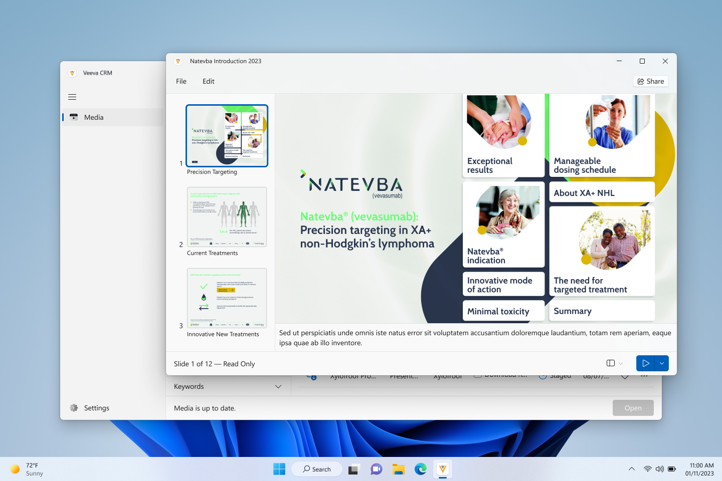
The Slide Sorter button now displays next to the Start Slideshow button in the bottom right corner. Additionally, a Share button now displays in the top right corner for presentations with web links configured.
Upgrade Alerts
When there is an optional app upgrade available, an alert displays in the bottom left corner above the Settings button as well as in the Settings menu. The alert colors depend on how many days have passed since the upgrade became available:
- Green - Fewer than two days
- Orange - Two to four days
- Red - More than four days
